INTERPOLATION -- PART I AND PHOTOGRAPHY


Sooner or later, we all want to make large prints. However, if a photographer prints at the native image size of his digital camera, he may be disappointed in the size of the print. For instance, at a typical printing resolution of 300 PPI, a six megapixel camera will produce a print approximately 6.7" X 10.0". Not a particularly impressive sized print. Particularly when one considers that reasonably priced inkjet printers now print at 13" x 19". On the other hand, those that have been around digital photography for even a little while know that six megapixel cameras are capable of producing sharp, photo quality prints at 13" x 19" and even larger.
So, what's the secret? How do we get from 6.7" X 10.0" to much larger prints without lowering the printing PPI? Obviously, we have to create more pixels. This process of creating more pixels is called interpolation. This is done by software magic. Interpolation software analyses the pixels in an image and adds more pixels based on that analysis. As an example, a 200% interpolation would double the linear size of an image. In other words, it doubles the size of the image in each of its two dimensions (i.e., length and width). As a result, each pixel becomes four pixels (essentially a 2 x 2 grid). The image quadruples in size, and the photographer can now print that image (originally at 6.7" X 10.0") at a size of 13.3" x 20.0" with the printing resolution unchanged.
Sounds like a sweet deal. But not all is perfect in the land of interpolation. Interpolation comes at a cost. There are three primary problems with interpolation:
Problem 1: Interpolation does not Create New Data. No matter how the interpolation software does its magic, it is going to spread the limited information in a digital file over a larger area. Thus, a given amount of information from a digital file spread over the larger area of an interpolated file will not look as good as it did at its original size. As a consequence, there is a certain degree of image degradation that results from interpolating an image. Thus, an interpolated file from a six megapixel camera will not look as good as an image (that was not interpolated) from a twelve megapixel camera -- even if the file sizes are similar after the six megapixel image was interpolated.
Figure 1: Mojave Green
Problem 2: Interpolation can Result in Jaggies. Jaggies is the term used to describe when lines or curves, that should be smooth, become jagged. This is due to the digital nature of digital photography. Each digital image is made up of a grid of pixels. Thus, lines and curves in a digital image aren't really lines and curves at all. Rather, they are really made up of combinations of pixels (in this case, think of pixels as dots of color). In order to illustrate this concept, let's start with my friend in Figure 1 (actually, he isn't my friend at all; if he had had his way, he would have killed me). Figure 1 shows the entire image. Image 2 shows a close up of the snake's skin. At this magnification (100%), the curves that form the patterns appear relatively smooth. However, Figure 3 shows an extreme close-up of the snake. At this magnification (500%), it can be seen that the curves are really a jagged patterns of pixels (this figure was simply enlarged on the screen; it was not interpolated).
Figure 2: Mojave Green's Scales at 100% Magnification
Figure 3: Mojave Green's Scales at 500% Magnification
What does all this have to do with interpolation? At the native image size of a camera (before interpolation), those jagged edges are so small that they can not be seen. On the other hand, as an image is interpolated larger, the jagged edges can become more visible. At some point, they may become obvious and detract from the image.
Now, if an image was enlarged by simply duplicating the pixels, the jaggies would become a major problem (the image would end up looking like Figure 3). Lucky for us, interpolation software does not simply duplicate the pixels. The software is much more sophisticated than that. The software looks at the image one pixel at a time. For each individual pixel, the interpolation software looks at the color of that pixel as well as the color of the neighboring pixels. When creating the new pixels, the software attempts to figure out what the color of these new pixels should be based on the software's analysis of the original pixel and its neighbors. Figure 4 demonstrates what the interpolation software does. After analyzing the original pixels 1 and 2, the software creates a new pixel with a color that is between the colors of the original pixels (this figure oversimplifies the process for illustration purposes, but it demonstrates the main point).
Figure 4: What Interpolation Software Does
Something called anti-aliasing now comes into play during the interpolation that helps suppress the jaggies. A look back at Figure 3 shows that the jaggies are most noticeable where light pixels border dark pixels. This creates a hard edge that makes the jaggies stand out. Figure 5 shows how anti-aliasing helps minimize the jaggies. Figure 5 demonstrates the concept in black and white in order to simplify the concept. Before interpolation, the eye sees sharp black/white edges that make the jaggies stand out. This is shown in the first histogram that shows the tonal values of an edge. The pixels go from dark on the left side of the histogram to light on the right side. As can be seen, the tonal transition is abrupt. During interpolation, new pixels are added along the edge. These new pixels will be given values between the black pixels on one side of the line and the white pixels on the other. In other words, the interpolation will place pixels of varying densities of gray between the black and white pixels along the edge. This is shown in the second histogram. The tonal transition has been made more gradual by the introduction of the new gray pixels. Now, instead of the hard black/white edge, there is a softer black/gray/white transition. This softens the jaggies and makes them less noticeable.
Figure 5: Anti-Aliasing
Comparing Figures 6 and 7 shows how interpolation actually reduces the jaggies. Figure 6 shows the original 500% enlargement (the image simply enlarged on the screen, not interpolated). Figure 7 shows a 500% interpolation of the same image. Clearly, the interpolation has dramatically reduced the jaggies. This softening of the edges, and thus the jaggies, is called anti-aliasing.
Figure 6: Mojave Green's Scales at 500% Magnification
Figure 7: Mojave Green's Scales at 500% Interpolation
One thing to keep in mind is that, while interpolation software does its best to reduce jaggies, the software can not completely eliminate them. As images are interpolated larger, the jaggies become more of an issue.
Problem 3: Interpolation Causes a loss in Sharpness. The same process that smoothes out the jaggies, does the same to the edges in an image. Imagine that an image has a nice sharp edge (it has an abrupt black/white transition). Looking back at Figure 5 shows what will happen to that edge. The nice, sharp black/white transition will be changed to a much softer black/gray/white transition. This will cause a reduction in acutance (for an explanation of acutance, see my article titledSharpening -- Part I). This will be interpreted by a viewer of the image as a loss of sharpness. This is why most sharpening should be performed after interpolation.

INTERPOLATION ALGORITHMS

Despite the limitations of interpolation, used intelligently, it can do a very good job of increasing the size of images. Of course, discerning photographers want the best prints possible -- thus, the best interpolation possible is required.
As far as quality of interpolation is concerned, one of the important factors is the interpolation algorithm used. It is the algorithm that determines how the color values of the new pixels are calculated. Furthermore, not all algorithms are created equal. Some create better results than others.
So, what are the options, and which is the best? The options tend to fall into two categories. In the first category are the interpolation algorithms in Photoshop. In the second category are the interpolation software packages offered by other companies that claim to produce superior results. Since the choice of interpolation algorithm can have a significant impact on the quality of a final print, the rest of this article will look at the Photoshop interpolation algorithms and two independent interpolation software packages as shown in the list below:
  • Photoshop Interpolation Algorithms.
    • Nearest Neighbor.
    • Bilinear.
    • Bicubic.
    • Bicubic Smoother.
    • Stairstep.
  • Independent Interpolation Software Packages.
    • Genuine Fractals.
    • PhotoZoom Professional (uses S-Spline algorithm).
There are other independent software packages available. However, these options are some of the most commonly used. Since it would take an extraordinary amount of time to evaluate all of the interpolation packages, this article will focus on these popular options.
The primary difference between algorithms is how they analyze the color of the pixels and use that information to determine the color values of the new pixels. Thus, a good starting point for analyzing interpolation options is to understand how they use the pixel data to determine the color values of the new pixels.
Nearest Neighbor: The Nearest Neighbor interpolation is the fastest option. However, it is also the least sophisticated. It simply takes the color of a pixel and assigns it to the new pixels that are created from that pixel. Due to this rather simplistic approach, Nearest Neighbor interpolation does not create an anti-aliasing effect. This leads to problems with jaggies. Consequently, Nearest Neighbor interpolation is considered to be incapable of producing photographic quality work. As a result. This interpolation method will not be considered further in this article.
Bilinear: Bilinear interpolation uses the information from a pixel (let's call it the original pixel) and four of the pixels that touch it to determine the color of the new pixels that are created from the original pixel. Bilinear uses rather simple, linear calculations to do this. The Bilinear interpolation does have an anti-aliasing effect. However, it is not considered good enough for photo quality images. Therefore, the Bilinear interpolation will not be considered further in this article.
Bicubic: Bicubic interpolation uses the information from an original pixel and sixteen of the surrounding pixels to determine the color of the new pixels that are created from the original pixel. Bicubic interpolation is a big improvement over the previous two interpolation methods for two reasons: (1) Bicubic interpolation uses data from a larger number of pixels and (2) Bicubic interpolation uses a Bicubic calculation that is more sophisticated than the calculations of the previous interpolation methods. Bicubic interpolation is capable of producing photo quality results and is probably the method most commonly used.
Bicubic Smoother: Bicubic Smoother interpolation is a relatively new addition to the Photoshop interpolation methods. It also uses a Bicubic calculation. My understanding is that it samples data from a larger number of pixels than Bicubic interpolation. The claim is that it produces a smoother interpolation than Bicubic.
Stairstep: You will not find a Stairstep interpolation method in Photoshop. Rather, it is a procedure that is followed using Bicubic interpolation. With Stairstep interpolation, the interpolation is done in small increments using Bicubic interpolation. In other words, the interpolation is done in several small steps rather than one step as in traditional Bicubic interpolation. Generally, Stairstep interpolation is done in 10% increments (each interpolation is made 10% larger than the last) until the desired image size is reached.
PhotoZoom Professional/S-Spline: PhotoZoom Professional uses an S-Spline algorithm (it also has other options, but the S-Spline is the one in which we are interested). According to the company that sells PhotoZoom Professional (BenVista), the advantage of the S-Spline algorithm is that it determines the color of new pixels by a more sophisticated algorithm that changes its calculations based on the color values found in an image. In other words, interpolation methods such as Bicubic use the same formulas for each pixel that is interpolated (e.g., the same formula or weights are used regardless of what the surrounding pixels look like). S-Spline interpolation analyzes the surrounding pixels and changes its formulas/weights depending on the color values of those pixels.
Genuine Fractals: Genuine Fractals samples from a larger number of pixels than Bicubic interpolation and uses its own algorithm to determine the value of the new pixels.

THE PROOF IS IN THE PUDDING

Often, you will find people that swear by a particular product or technique, claiming that it is better than any other option available. The problem is, you can find other people that swear at the very same product or technique. This is the case for interpolation. Each method has its fans and detractors. However, for the photographer that wants to produce the best prints possible, what it really boils down to is the old saying, "The proof is in the pudding". Rhetoric aside, what we are really interested in is which interpolation method produces the best images. This can be determined only by interpolating some images using the various interpolation methods and comparing the results.
Thus, the rest of this article will focus on comparing interpolations of four images using the following interpolation methods: Bicubic, Bicubic Smoother, Stairstep, S-Spline (PhotoZoom Professional), and Genuine Fractals.
To make a fair comparison, three factors need to be considered:
The image: The best interpolation method for an image may depend on the image itself. In other words, one shoe may not fit all. One interpolation method may work best for one image and anther interpolation method may work best for another image. Therefore, this article will compare interpolations of four images to determine if this issue is a valid concern.
Image size: The best interpolation method for one size of enlargement may not necessarily be the best method for a different size. Therefore, this article will compare interpolations of the images at three enlargements: 200%, 300%, and 400%. To get an idea of how large a print these interpolation amounts will produce, Table 1 shows the printed sizes of images (at 300 PPI) from some popular sensor sizes (both at their native image size and interpolated at the various enlargements).
Table 1: Image Sizes (in inches) Printed at 300 PPI
Sensor SizeNative Size200%300%400%
3 Megapixel
4.7 x 7.1
9.4 x 14.1
14.1 x 21.2
18.9 x 28.3
6 Megapixel
6.7 X 10.0
13.3 x 20.0
20.0 x 30.0
26.7 x 40.0
8 Megapixel
7.7 x 11.5
15.4 x 23.1
23.1 x 34.6
30.8 x 46.2
12.8 Megapixel
9.7 x 14 .6
19.5 x 29.2
29.2 x 43.8
38.9 x 58.4
16.7 Megapixel
11.1 x 16.7
22.2 x 33.4
33.4 x 50.0
44.5 x 66.7
Sharpening: I debated how to best present the results of the interpolations (i.e., should I show the unsharpened images or the sharpened ones; if the sharpened images are shown, which sharpening method should be used). After considerable work experimenting with the interpolations, I came to the following conclusions. It is really difficult to judge the quality of the interpolations in the unsharpened images. Problems such as halos or jaggies often don't really stand out until the image is sharpened. Furthermore, in the real world, images have to be sharpened after interpolation anyway. Therefore, the images shown have all been sharpened. The images were sharpened using a two step approach. All interpolations for a particular image received the exact same sharpening approach and amount. If you would like to see one of the images without sharpening, simply move the mouse over the image and the unsharpened version will appear.
The images that were used for the interpolations are shown in Figures 8 to 11. Each of these images was shot with a high quality DSLR with the following sensor sizes: Figure 8 (6 megapixel), Figure 9 (8 megapixel), and Figures 10 and 11 (12.8 megapixels). Each image was shot with a professional grade lens. Crops from these images are shown in the rest of this article to compare the interpolation methods. One thing to keep in mind is that I am looking at the actual images on a large, high quality, color calibrated monitor. You are looking at JPEG copies of the images through your monitor. Your ability to see what is described in the analyses below depends on the quality of your monitor.
Figure 8: Egret
Figure 9: Mojave Green
Figure 10: Clock
Figure 11: Doll

INTERPOLATION: EGRET AT 200%

The first image is the Egret. Figures 12 to 16 show the interpolations for this image.
Figure 12: Bicubic
Figure 13: Bicubic Smoother
Figure 14: Stairstep
Figure 15: Genuine Fractals
Figure 16: S-Spline
The most noticeable thing about the 200% Egret interpolations is that there is very little difference between the interpolations. I suppose that one could pick a favorite, but I doubt that the differences would show up in a print.

INTERPOLATION: MOJAVE GREEN AT 200%

The second mage is the Mojave Green Rattlesnake. Figures 17 to 21 show the interpolations for the Mojave Green.
Figure 17: Bicubic
Figure 18: Bicubic Smoother
Figure 19: Stairstep
Figure 20: Genuine Fractals
Figure 21: S-Spline
Again, at 200% interpolation, there appears to be little difference between the images. The S-Spline does look a little bit sharper to my eyes, but it also looks a bit grainier. Other than that, there is little else to differentiate the images from each other. As before, it is highly unlikely that that any differences would be noticed in a print.

INTERPOLATION: CLOCK AT 200%

The third mage is the Clock. Figures 22 to 26 show the interpolations for the clock.
Figure 22: Bicubic
Figure 23: Bicubic Smoother
Figure 24: Stairstep
Figure 25: Genuine Fractals
Figure 26: S-Spline
Again, at 200% interpolation, the differences are slight.

INTERPOLATION: DOLL AT 200%

The Last mage is the doll. Figures 27 to 31 show the interpolations for the doll.
Figure 27: Bicubic
Figure 28: Bicubic Smoother
Figure 29: Stairstep
Figure 30: Genuine Fractals
Figure 31: S-Spline
For the doll at 200% interpolation, it appears to me that Genuine Fractals produced a cleaner rendering of the fine detail of the hair. There doesn't appear to be much of a difference between the other interpolations.

200% INTERPOLATION CONCLUSIONS

The primary conclusion for the 200% interpolations is rather clear and simple:
In most cases, the differences between the interpolation methods, at this level, are relatively small and will probably not be noticeable in a print. This is very significant since most photographers will not interpolate much beyond 200%. For instance, the most popular DSLRs, right now, are around eight megapixels. A 200% interpolation printed at 300 PPI will yield a 15.4 x 23.1 print. Considering that the most popular inkjet printers, at this time, will not print larger than 13 x 19, it does not seem likely that most photographers will need to interpolate much beyond 200% on a regular basis. Even a 20 x 30 print at 300 PPI will only need a 260% interpolation from an eight megapixel camera.

DIGITAL EXPOSURE and Photography


DIGITAL EXPOSURE  and Photography

I want to start off by stating that not everyone accepts the information presented in this section on exposure. So, I will present the information and let the reader decide whether or not to utilize this exposure method (I do).

Exposure is one of the most basic of photographic skills. Proper exposure allows the photographer to maximize the quality of the image and to determine where detail will appear in an image. Yet, different photographic materials/equipment require different exposure methods. Photographers shooting color slide film must always keep in mind the very limited dynamic range of the film and the fact that the image can not be adjusted after exposure. This often means that they must expose in such a manner as to protect the highlights from blowing out. On the other hand, photographers that shoot black and white negative film have a very wide dynamic range and can make extensive adjustments to the image in the dark room. They often follow Ansel Adams advice to expose for the shadows and develop for the highlights. Digital cameras also have a best method of exposure. This method often differs from what many photographers utilize.

In color photography, people often expose for the mid tones. They may take a meter reading off a gray card, or they may find a mid tone object in the image and meter off that. Some adjustments to the exposure may then be made to ensure that detail is kept in the shadows or highlights. On film, this makes the image look natural. The mid tones in the image appear as they did in the actual scene.

Figure 1: Sedona

Figure 1 shows an image that was exposed this way. The image was shot during the last few minutes of evening light. The exposure was set so that the rocks would come in at the right tonal level. Figure 2 shows the histogram of this image. The histogram shows that the image is composed mostly of darker tones with fewer of the lighter tones present in the image. In other words, the histogram accurately reflects the tonal distribution present in the scene at the time of exposure. For film, this would be an acceptable exposure. However, such an exposure would fail to take advantage of the unique characteristics of the digital sensor. Such an exposure would fail to maximize both the number of shades available in the image and the signal to noise ratio.

Figure 2: Histogram -- Normal Exposure

To understand what is going on in this situation, we have to go back to the issue of bits. Since the exposure technique that is going to be discussed is generally used with raw, we will be dealing with sensors where each pixel is capable of rendering 4,096 shades of color.

Figure 3: Four Stop Exposure on a Five Stop Dynamic Range Sensor (Before Application of Any Tonal Curves)

Looking at Figure 2 again shows that the histogram does not extend all the way to the right. Since a histogram shows the distribution of pixels, from the pixels that received little light on the left side of the distribution to the pixels that received a lot of light on the right side, the gap to the right side of this distribution shows that no pixels reached full exposure (full well capacity). In other words, if the sensor is a 5 stop dynamic range sensor, no pixels reached five stops of exposure. A better guess would be that the brightest pixels in this image received a little more than 4 stops of light. For the sake of simplicity, let's assume that the sensor received exactly four stops of light. Figure 3 shows that when a five stop dynamic range pixel is exposed to 4 stops of light, it is capable of rendering only 2,048 shades (before the application of any tonal curves). Thus, this exposure method threw away half of the 4,096 shades that the camera is capable of rendering. As a consequence, this exposure reduced the quality of the image.

Figure 4: 100% Crop from a Low Noise Image

Figure 5: 100% Crop from a High Noise Image

In addition, this exposure method reduces image quality in another way. All digital sensors have noise. Noise is the digital equivalent of grain in film. At the pixel level, noise is a random variation in the charge on a pixel that is due to factors other than the scene that is being photographed. At the image level, noise manifests itself by random detail in an image that distracts from the real detail (that comes from the scene that was photographed) in the image. Noise is usually most noticeable in areas of little detail such as featureless skies or out of focus backgrounds. Figure 4 shows a 100% crop from a section of sky from an image that has very little noise. As can be seen, the image looks very clean with no distracting random detail. Figure 5 shows a 100% crop from an out of focus background of an image with significant noise. The image has an almost sandpaper like look. The noise noticeably reduces the quality of the image.


The real issue for digital cameras is the signal to noise ratio (SNR), which is the ratio of the signal the pixels get to the noise that is generated during the exposure. The higher the SNR, the better the image quality. Anything that degrades the SNR, degrades the image quality. The SNR can be degraded by either increasing the noise or decreasing the signal. On the noise side of the SNR, sensors have several types of noise. Some of them vary with the amount of exposure (more exposure means more noise but also more signal). However, one type of noise is relatively constant; it does not vary with the amount of exposure. This noise is known as dark current noise, and it is in large part responsible for determining the noise floor (along with the readout noise) for the sensor. Anything that increases the signal with respect to the noise floor increases the SNR. Conversely, anything that decreases the signal with respect to the noise floor reduces the SNR.

A look back at Figures 2 and 3 indicate how a "normal" exposure impacts the SNR. The histogram in Figure 2, again, shows that no pixels reached full well capacity. As before, assuming a four stop exposure on a five stop dynamic range sensor, Figure 3 shows that the brightest pixels in the image are filled only half way. The green part of the pixel in Figure 3 shows that the pixel has only half the number of shades as a full well capacity sensor. This green part also represents the amount of signal that the pixel has received. Accordingly, the pixel has received only half as much signal as a full well capacity pixel. Since the signal has been reduced with respect to the noise floor, the SNR has been reduced by the normal exposure.

Figure 6: Histogram -- Maximum Exposure

The solution to both the issue of the reduced number of shades of color and the SNR degradation is to maximize the exposure (also known as exposing to the right). In the case of maximizing the exposure, the exposure is increased until the brightest pixels reach their full well capacity. In this case, the brightest pixels receive as much light as they can. The proper exposure can be checked with the camera's histogram. Figure 6 shows an image that used the maximum exposure. The histogram has been shifted to the right. It can be seen that there is no longer a gap on the right side of the histogram as in the normal exposure; instead, the brightest pixels just touch the right side of the chart.


Figure 7: Five Stop Exposure on a Five Stop Dynamic Range Sensor (Before Application of Any Tonal Curves)

Figure 7 shows what one of the brightest pixels with a maximized exposure would look like. It can be seen that this pixel is capable of rendering 4,096 shades. Comparing this figure to Figure 3 shows that we have recaptured the 2,048 shades that were lost with the normal exposure. By increasing the number of shades in the image, maximizing the exposure has increased the quality of the image.

Figure 7 also indicates how maximizing the exposure improves the SNR. The green part of the pixel in the figure shows that the pixel is now completely filled up with signal. Thus, the pixel has maximized its signal. Since the signal has been maximized with respect to the noise floor, the SNR has been significantly increased.

Consequently, maximizing the exposure insures that the image has the largest number of shades and the best SNR possible for any given set of conditions. Of course, the problem is that the image may now appear overexposed. If printed without any corrections, the image might be too light. The solution is easy; the entire image needs to be darkened in a linear fashion. What this means is that every pixel needs to be darkened by the same amount. This is easily handled by the exposure adjustment in the raw converter.

There is one caveat to this technique. The photographer must be careful not to carry the exposure too far. If too much exposure is given, the highlight details will be blown. Utilization of the histogram and the "blinkies" (when areas of the LCD screen on the camera blink to indicate areas of overexposure) will help the photographer determine the proper exposure.


ADVANTAGES OF FOURTEEN BIT CAMERAS-- PART II


QUANTIZATION ERROR

Figure 1: Curve to Lighten Image
In the previous article, the posterization that can occur when tonal values are stretched out (i.e. the tonal values are pulled farther apart) was discussed. This posterization often occurs when lightening the shadows. However, posterization is not the only problem that causes image degradation when editing the tones in an image. Whenever some tonal values are stretched out, other tonal values must be compressed (i.e. the tonal values are pushed closer together). This is always the case unless other techniques, such as masking or the Blend-if tool, are used to mitigate the compression. For instance, when Curves is used to lighten the shadows by stretching out the tones, either the midtones or the highlights will be compressed. This compression causes image degradation. An example is shown in Figures 1 and 2. Figure 1 shows a curve used to lighten an image. This curve stretches out the shadow tonal values. However, it also compresses the highlight values. Figure 2 gives the numeric values of the lightest twenty-six tones (230 -- 255) both before and after editing with a curve like the one in Figure 1. For example, the original value of 230 has been increased to 238 and the original value of 245 has been increased to 248.
Figure 2: Highlight Tonal Values Before and After Editing
An examination of Figure 2 reveals a disquieting problem. What used to be separate tones before editing have been compressed into the same tone after editing. The original tones 247 and 248 have both become 250 after editing. Similarly, the original tones 250 and 251 have both become 252 after editing. This compression of tones is called quantization error and results in a loss of tones and image detail. Compression of the tones into fewer tonal spaces can be seen in Figures 3 and 4. Figure 3 shows a histogram before any image editing. Figure 4 shows the same image after the editing has been performed. The right side of this histogram shows where quantization error has caused some of the pixels to "pile up" in the remaining tonal levels resulting in upward spikes in the histogram.
Quantization error is due to the digital nature of digital images. When image editing is performed, Photoshop runs the digital numbers (e.g., tones) through formulas to determine the new numbers. However, the new numbers have to be rounded off to the nearest digital number (e.g., a new tone of 157.43 would be rounded to 157). Consequently, two or more tones can be rounded off to the same tonal number. The information that is rounded off is thrown away forever. Thus, information is lost in the rounding process and quantization error occurs.
Figure 3: Histogram before Image Editing
Figure 4: Histogram after Image Editing Showing Quantization Error
Figure 5: Curve to Darken Image
Now, the loss of tones in this example is not such a big deal since the compression occurred in the highlights. Since the highlights have a large number of tones (as covered in the previous article), the loss of a few tones can be tolerated in either twelve or fourteen bit images (the loss in eight bit JPEG images might be more noticeable). However, if a curve like the one shown in Figure 5 is used, tonal compression can be a much bigger issue. This curve was used to darken an image. The problem is that it compressed the shadows resulting a loss of shadow tones. Unfortunately, the shadows have few tones to begin with. Reducing the number of shadow tones through quantization error could result in a noticeable loss of image quality in the shadows.
The use of fourteen bit images does not stop quantization error. However, it does make it less noticeable. Since there are many more tones in a fourteen bit image than in a twelve bit image, the loss of the tones due to quantization error will be less noticeable in the higher bit image.

BLACK AND WHITE

A twelve bit color image has three color channels. Each channel has 4,096 shades. Since the interpolation uses all three channels when calculating the color, a twelve bit color image has 4,0963 = 68,719,476,736 possible colors. However, if a twelve bit image is converted to black and white, the image will have only 4,096 shades of gray. This is because different colors have the same gray value. This is shown in Figures 6 and 7. Figure 6 shows two colors. The first color has the RGB values of 200, 100, 100. The second color has the values of 100, 100, 200. These are clearly distinct colors. However, Figure 7 shows what happens when the colors are converted to grayscale. They have the same tonal values.
Since a fourteen bit file has four times as many gray tones as a twelve bit file, the fourteen bit file has an advantage when editing black and white images (i.e., the fourteen bit file will have less problems with posterization and quantization error).
Figure 6: Two Colors
Figure 7: Gray Values of the Two Colors

COLOR SPACES

Bit depth also plays a role in color space selection. The bits of a digital file must be spread across the entire color space that is used with an image. When wide color spaces are used, the bits must be spread farther apart to cover all of the colors. This increases the possibility of posterization (especially in the shadows). Since a fourteen bit file places the colors closer together, due to the increased number of tones, a photographer can use a larger color space with less risk of posterization.

BITS AND DYNAMIC RANGE -- A FALLACY

Sometimes, people try to equate bit depth (e.g., eight bit, twelve bit, or fourteen bit files) with dynamic range. I have heard comments that JPEG files have a smaller dynamic range than raw files because the JPEG files are only eight bit while the raw files are usually twelve or fourteen bit. This is an incorrect statement. While it is true that some JPEG files have less dynamic range than files that were converted from raw, it has nothing to do with bit depth. Rather, the dynamic range of a camera is determined primarily by the characteristics of the sensor (e.g., the size of the sensor and the microlens).
What the bit depth does determine is tonal range. Tonal range is the number of tones from the darkest to the lightest tones. A twelve bit file has a tonal range of 4,096 tones, and a fourteen bit file has a tonal range of 16,384 tones. In other words, as covered previously, the larger bit depth files have the tones more closely spaced than lower bit files.
The reason that cameras with large dynamic ranges often have large bit depths has to do with posterization. As the dynamic range becomes larger, the tones become spaced farther apart. When the image is edited, the tones will likely become spread even farther apart. If the tones become spread too far apart, posterization occurs. To reduce the possibility of posterization, large dynamic range cameras usually have large bit depths so that the tones are spaced closely together. This produces smooth tonal transitions.

BITS AND JPG

The advantages of fourteen bit files are lost on those that shoot JPG. JPEG images are converted to eight bit before any image processing is carried out. Thus, they do not benefit from the additional bits.

IS IT WORTH THE UPGRADE

So, is it worth upgrading to a new camera to get the extra two bits? Each person will have to answer this question for herself. However, if you are not experiencing any significant problems with posterization, quantization error, the use of large color spaces, or a lack of detail in your shadows, the additional bits may not be worth the cost of the upgrade. As for myself, I may buy the next generation of my camera model because I expect a number of upgrades, including a fourteen bit sensor. However, I would not buy the new camera if the move to fourteen bits was the only major improvement.

ADVANTAGES OF FOURTEEN BIT CAMERAS-- PART I


ADVANTAGES OF FOURTEEN BIT CAMERAS-- PART I

Article and Photography by Ron Bigelow

Recently, some new DSLRs have been released that provide fourteen bits of color depth. This is good news. However, not necessarily for all of the reasons that some photographers think. Rather, the additional bits provide improvements in very specific areas while providing no improvements in others. Thus, the purpose of this article is to analyze the benefits of increasing the color depth to fourteen bits.

BITS

To understand what the excitement is all about, we first have to understand a little bit about bits.
Within each digital camera is a chip called a sensor. Despite its small size, this sensor is the most expensive and complicated part of the entire digital camera. The sensor is the device that collects and processes the light that is used to create an image; it takes the place of the film that is used in traditional cameras. Each sensor is composed of an array (rectangle) of tiny pixels (photodiodes). Each pixel is composed of a light sensitive semiconductor material.
Light, in the form of photons (tiny packets of light), arrives at each pixel. The light, from an area slightly larger than the active part of the pixel, is focused by a microlens. The light then passes through a color filter array (also known as a Bayer filter). Finally, the light enters the pixel. At this point, the light interacts with the semiconductor material of the pixel to create an electrical charge.
The pixel now has an electrical charge. Of course, the same thing was happening with all of the other pixels in the sensor. For example, in the case of a ten megapixel camera, there would be approximately ten million pixels each with its own electrical charge waiting to be processed into a beautiful image.
Now that the pixels have all those electrical charges, the work of processing those charges into meaningful information that can be used to create an image begins. Figure 2 shows a simplified flowchart of the raw process and subsequent processing.
Figure 1: Raw Process and Subsequent Processing.
Let's go over the steps, in Figure 1, that create a raw file.
  1. The light photons reach the sensor.
  2. The photons create electrical charges on the pixels.
  3. The electrical charges are accumulated and stored. These electrical charges create voltages.
  4. The voltages are amplified (increased in magnitude).
  5. Up until step 5, the digital camera has not been digital at all -- it has been collecting and measuring analog data. In step 5 and step 6, the ADC (analog to digital converter) changes the analog, voltage information into digital information. In step 5, the ADC carries out the first step of the conversion by converting the voltage information into discrete numbers.
  6. The ADC now carries out the second step of the conversion by converting the discrete data into digital data. At the end of step 6, the raw file has been created. All of the subsequent steps are carried out on the raw file in the raw converter.
  7. Digital cameras are colorblind. They can neither see nor measure color. All of those pixels measure only the intensity of light. In a sense, the pixels are only measuring tones of gray. So, how are the colors produced? They are produced through filters and software magic. Above a sensor is a filter array. This filter array filters the light so that each pixel sees only one of three colors of light. Some of the pixels see only red light, some only see green light, and the others only see blue light. In step 7, software looks at each pixel and determines the light intensity of the color of light at that pixel. The software also looks at the light intensity at each of the pixel's neighboring pixels (which will have their own colored light levels). Using this information, the software calculates a color for each pixel and assigns that color value to the pixel. This process is called Bayer interpolation.
  8. White balance adjustments are made. This step corrects for the color of the light that is illuminating the objects being photographed.
  9. At this point, the image data is very dark. A tonal curve is now applied to lighten the image and make it look more natural.
The important point here is that the bits are created by the ADC in steps 5 and 6. All that is happening at this point is that the ADC is taking analogue information from the sensor and changing it into digital information. This happens after the sensor has gathered the information and stored it as analogue, voltage information. Why is this important to understand? Once this is understood, it becomes obvious that increasing the bit depth of an image (e.g. from 12 to 14 bits) does not improve the quality of the information captured by the sensor. That information has been captured and stored by the sensor before it ever gets touched by the ADC. All that is happening when the bits are created is the ADC is changing the format in which the data is stored.

MORE BITS

Currently, the raw files of many digital cameras are twelve bits. That means that each pixel can register 212 = 4,096 levels of light intensity (after conversion by the ADC). In other words, each pixel can render 4,096 shades. Traditionally, 0 represents pure black and 4,095 represents pure white. As you go from 0 to 4,095, the shades go from dark to light. Previously, it was mentioned that some pixels measured red light, some green, and some blue. Therefore, there are 4,096 possible shades of red, 4,096 of green, and 4,096 of blue. When the Bayer interpolation does its magic to calculate a color for each pixel, it uses the color information for each pixel and its neighboring pixels. Since the interpolation is using information from all three colors, there are 4,0963 = 68,719,476,736 possible colors with a twelve bit raw file.
The raw files of some of the newer cameras are fourteen bit. That means that each pixel can register 214 = 16,384 levels of light intensity. Now, when the Bayer interpolation does its magic, there are 16,3843 = 4,398,046,511,104 possible colors. That is sixty-four times more colors than the twelve bit file!
It turns out that the human eye can only see about 16,000,000 colors. In other words, the human eye can not tell the difference between many of the extra colors that can be produced from a fourteen bit file. So, if we can not see all those extra colors, what's the big deal about having fourteen bit files? Well, it turns out that the sensor in the camera plays a dirty, little trick on you.
The little trick is that most digital camera sensors are linear devices. What that means is that when the amount of light that reaches a sensor is doubled, the output of the sensor is doubled. The problem starts to reveal itself when we look at bits in conjunction with the dynamic range of the sensor. Dynamic range is a measure of the span of tonal values over which a device (in this case a sensor) can hold detail. In other words, it is the tonal distance from the darkest point at which the device holds detail to the lightest point. Dynamic range is measured in stops of light. When light is increased by one stop, the amount of light is doubled (going in the other direction, it is cut in half). For instance, a photographer may say that he doubled his exposure by opening up the lens by one stop.
For our purposes, we will assume that you have a camera with a dynamic range of nine stops. The shades that an individual sensor can render in a file must be spread across those nine stops. The problem is that those shades are not spread evenly across the dynamic range of the camera.
Now, let's do a little analysis for a pixel that will output its data to a twelve bit file. For this analysis, it must be kept in mind that all of the numbers that are being generated represent the process prior to step 7 in Figure 1. In other words, these numbers represent the state of the information before any tonal curves (i.e., gamma or transfer function) have been applied. They do not represent the final file.
Suppose that a sensor was exposed until the pixels, that received the most light, could accept no more light. In the case of our nine stop dynamic range camera, the sensor would have received nine stops of light. That is to say that the brightest pixels in the sensor would have received nine stops of light. The brightest pixels would be full; these pixels would have reached their full well capacity. Image A in Figure 2 shows such a sensor with the brightest pixels at full well capacity. Now, with a twelve bit ADC, this sensor is capable of rendering 4,096 shades as covered above.
Figure 2: Shades vs. Stops of Light for a Twelve Bit Camera with a Nine Stop Dynamic Range (for the Brightest Four Stops)
As we move on to analyze the situation shown in Figure 2, the key to understanding what is happening is to remember that, when the exposure is reduced by one stop, the light is reduced by half. Since sensors are linear devices, when the light is reduced by half, the sensor will only be able to render half as many shades.
Now, not all of the pixels received a full nine stops of light. If we ignore the brightest pixels (the ones that received nine stops of light) and look at the pixels that are left, we have the situation shown in Image B in Figure 2. The brightest pixels that are left received eight stops of light (half as much light as the pixels that received nine stops of light). Since sensors are linear and the brightest pixels in Image B received only half as much light as the brightest pixels in Image A, the pixels in Image B would be able to render only half as many shades. Thus, the pixels in image B rendered only 2,048 shades. Since the pixels in Image A (with nine stops of exposure) rendered 4,096 shades and the pixels in Image B (with eight stops of exposure) rendered only 2,048 shades, the ninth stop of light was responsible for rendering the other 2,046 shades. In other words, the brightest stop of dynamic range (the ninth stop) used up half of all the available shades.
The procedure repeats itself. If we ignore the brightest pixels in Image B (the ones that received eight stops of light) and look at the pixels that are left, we have the situation shown in Image C. The brightest pixels that are left received seven stops of light. Since the brightest pixels in Image C received only half as much light as the brightest pixels in Image B, the pixels in Image C would be able to render only half as many shades. Accordingly, the pixels in Image C rendered 1,024 shades. Since the pixels in Image B (with eight stops of exposure) rendered 2,048 shades and the pixels in Image C (with seven stops of exposure) rendered 1,024 shades, the eighth stop of light was responsible for rendering the other 1,024 shades. In other words, the second brightest stop of dynamic range (the eighth stop) used up one fourth of all the available shades.
At this point, we can see that the two brightest stops render 75% of all the shades the camera is capable of producing. The rest of the images in Figure 2 show that, as we continue to work down the dynamic range, the camera is capable of rendering less and less shades. Eventually, one stop of light is reached. This last stop of light is capable of rendering only 16 shades.
The exact same process can be carried out for a fourteen bit sensor. The difference is that the sensor starts off with 16,384 shades. Table 1 summarizes the distribution of the shades across the dynamic range for both twelve and fourteen bit files.
Table 1: Distribution of Shades for a Nine Stop Dynamic Range Prior to Application of Tonal Curves (i.e., Gamma or Transfer Function)
LIGHT LEVEL12 Bits
14 Bits
Nine Stops2,0488,192
Eight Stops1,0244,096
Seven Stops5122,048
Six Stops2561,024
Five Stops128512
Four Stops64256
Three Stops32128
Two Stops1664
One Stop1664

SHADOWS

As can be seen from the chart, the shades are not evenly distributed over the nine stops of dynamic range. More of the shades are allocated to the brightest areas, and far fewer shades are allocated to the darker areas. This causes problems for the shadows -- there are not many shades to render the shadows. This results in less detail in the shadows than in other areas of the image that received more light.
This problem now gets compounded by the human visual system. While the sensor may be a linear device, the human visual system is not. The human visual system is more sensitive to some amounts of light than others. In Particular, the human visual system is more sensitive to shadows than highlights. What this means is that increasing the amount of light in a shadow area will register a larger impact on the visual system than increasing the amount of light, by the same percentage, in the highlights. We now have a situation where we have the least amount of data in the area where the visual system is the most sensitive. This is where the fourteen bit file has an advantage. A fourteen bit file has more shades in the shadows than a twelve bit file. In fact, it has four times as many shades (for each of the three colors). This allows a fourteen bit file to render more shadow detail than a twelve bit file.
Now, it is also true that a fourteen bit file has four times as many shades (for each of the three colors) in the highlights as a twelve bit file. However, even a twelve bit file has so many shades in the highlights that the additional shades of a fourteen bit file do not noticeably improve the highlight detail.
In short, one of the biggest advantages of a fourteen bit file is the additional detail in the shadows.

POSTERIZATION

Figure 3: Shadow Tonal Values Before and After Editing
Generally, colors in an image blend gradually from one color to the next. It is impossible for the human eye to tell where one color stops and the next one picks up. However, in some cases, the transition from one color to the next can actually be seen. This usually occurs in areas of little detail. The result is an image where bands appear to run across the image. This problem is known as posterization (also known as banding). Posterization is highly undesirable, and it is particularly a problem in the shadows.
In essence, posterization occurs when image editing causes too few tones to be spread too far apart. A typical example is when Curves is used to lighten the shadows in an image. Curves takes the original tones and runs the numerical values of the tones through a formula to create the numerical values for the new tones. Figure 3 shows an example of what happens for one set of shadow tones when modified by a particular Curves adjustment. It can easily be seen that the original tones increase only one unit from any tone to the adjacent tone. However, after Curves, the tones are spread farther apart. For example, with the original tones, going from a tone of one to a tone of two gave a one unit increase in tone. However, after editing, the tonal value of one became a value of seven, and the tonal value of two became a value of eleven. Now, the difference between these two tones has become four units. A stronger adjustment would have spread the tones even farther apart. When editing spreads the tones far enough apart, the transition between tones can be seen and posterization occurs.
Since a fourteen bit file has more tones than a twelve bit file, the tones in a fourteen bit file are spaced closer together. Thus, editing is less likely to produce posterization in a fourteen bit file than in one of twelve bits. This is particularly important in the shadows where there are few tonal values with which to start.

Photoshop - What is Threshold?


Photoshop - What is Threshold?
There are several ways to adjust the dark and light areas of a photograph. I usually use the Levels tool but you might want to take a look at a tool called Threshold. Let's take a look at how I fixed my old family photo taken in Austria.
Start by creating a new adjustment layer using Threshold. The Threshold tool allows me to see what areas should be white and black in this faded old photograph.

Slide the triangle from right to left to see what should be white. In this example it was the paper in the hands of the family.
Then I slide the the white triangle from left to right to see where the blacks came in. The first data seen was below the skirt.

Knowing this I created a new adjustment layer - Levels. I selected the white eye dropper for the paper and the black eye dropper tool for the shadow under the skirt. And TA DA! I have a restored photograph!

If desired, use the mid-tone eyedropper to select what should be about 50% gray. Keep clicking with the mid-tone dropper until you like the finished results.
Here is a movie on how I did this. 

THE PROCEDURE

Since the human eye is not accurate enough for this task, the Info palette will be used (choose Window/Info). The Info palette shows the colors of any chosen point. The options for the Info palette are set by clicking on the pop-up menu in the upper right hand corner of the palette and choosing Palette Options (see Figure 6). The Palette Options dialog box appears as shown in Figure 7. Both the First Color Readout Mode and the Second Color Readout Mode should be set to Actual Color. Clicking the OK button closes the dialog box


Often, one of the first things that is done when editing an image is to set the shadow and highlight values. This is typically done using either Levels or Curves. One of the most exact methods of doing this is to use the Info palette in conjunction with the Color Sampler to identify locations that will be used to set the shadow and highlight values. Color samplers are set at these locations (for more information see, Levels -- Part I and Curves -- Part II). Then, the Eyedroppers in Levels or Curves are clicked at the color samplers to set the shadow and highlight values. The most challenging part is selecting the locations where the color samplers will be placed. For this, one must be able to differentiate between very small differences in tone. Frankly, the human eye just isn't accurate enough for this task.
When Levels is used, this is not a problem. With Levels open, holding down the Alt key and clicking on the Black Input Slider will turn the image white. As the slider is moved to the right, parts of the image will start to change color. The parts of the image that change color are being clipped. The first parts of the image to change color contain the darkest tones in the image. After evaluation with the Info palette, the shadow color sampler will be set somewhere in these dark areas (see Figures 1 and 2).
Figure 1: Levels with the Black Input Slider Moved to the Right
Figure 2: Image with the Black Input Slider Moved to the Right While Holding Down the Alt Key
Similarly, holding down the Alt key and clicking on the White Input Slider will turn the image black. As the slider is moved to the left, parts of the image will start to change color. The parts of the image that change color are being clipped. The first parts of the image to change color contain the lightest tones in the image. After evaluation with the Info palette, the highlight color sampler will be set somewhere in these light areas (see Figures 3 and 4).
Figure 3: Levels with the White Input Slider Moved to the Left
Figure 4: Image with the White Input Slider Moved to the Left While Holding Down the Alt Key
Once the shadow and highlight color samplers have been placed, the shadow and highlight values can be set as detailed in the Levels -- Part I article.
On the other hand, prior to CS3, Curves lacked any such capability to identify the darkest and lightest points in an image that can then be used to set the shadow and highlight color samplers. When one considers that Curves is a far more versatile and powerful tool than Levels, at first, this may seem a bit disappointing. Fortunately, the Threshold adjustment layer resolves the dilemma for those that have older versions of Photoshop. Even those that have newer versions of Photoshop may like to have an alternative method to identify the darkest and lightest points in an image. The rest of this article will focus on using the Threshold Adjustment layer to place the shadow and highlight color samplers.

THE IMAGE

Figure 5: Unedited Fall Color Image
To illustrate the procedure, the image in Figure 5 will be used. This image has not yet had any editing performed. Clearly, the image is flat and needs a boost in contrast. The first step to is to set the shadow and highlight values. For this, the shadow and highlight color samplers will need to be placed in the image.
Figure 6: Info Palette


.


Photoshop CS6 - Wonderful new tool?


Photoshop CS6 - Wonderful new tool?
I'm already looking for rumors about Photoshop CS6. Here is something that I'm hoping will be included.
I love the Content Aware Fill feature and use it a lot, but it's not perfect.
I've also played with the Content Aware Scale a few times to remove unwanted backgrounds. But again, it wasn't perfect.

The solution MAY be coming in the next version of Photoshop. I'm keeping all my fingers crossed.
This new tool called PatchMatch, will take these two features and make our Photoshopping dreams come true. It's a structural image editing tool that runs an algorithm to take Content Aware tools to new levels!
Check it out and keep your fingers crossed that we'll be seeing this feature in the next version of Photoshop.


Photoshop - Great selection shortcuts


Photoshop - Great selection shortcuts
Have you ever been working on an image trying to adjust the color or brightness and nothing is happening?!
This problem could be caused by a couple of things.

You might be on the wrong layer
You might have a small selection somewhere that you didn't notice
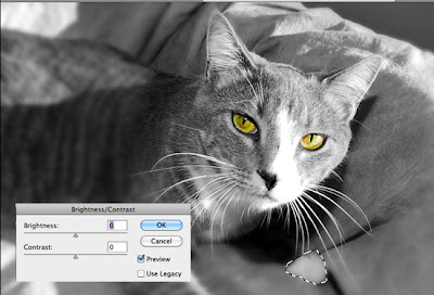
Here is a picture of my kitty Echo. I wanted to add a little more contrast but it seemed nothing was happening when I moved the sliders.
Note the selection around the paw. Photoshop was trying to add contrast to just this selection.
A quick shortcut to get rid of a selection is CTRL/CMD D. This quickly deselects any area or object that you might have had selected.

Here is another great trick with selections.
The marking ants indicating a selection is made but it is distracting and making it hard to see the edges as you adjust you can use the CTRL/CMD H to hide the "ants" allowing you to see the entire selection change (including the detail in the edges) without the extra animation you get with making selections. Hitting CTRL/CMD H again brings the selection outline back.
Of course, I've forgotten at times that I've hid the selection making the first trick of deselecting everything very useful!
Enjoy!

My video of the month - Boosting your Wifi signal with a beer can

P