The definitions used here are from the Photoshop help files, with a few bits of added explanation where I saw fit to add them.
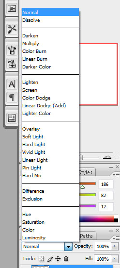
The Blend Modes specified in the options bar control how pixels in two separate layers interact with and effect each other. It’s helpful to think in terms of the following colors when visualizing a blending mode’s effect:
- The base color is the original color in the bottom layer.
- The blend color is the color being applied by the upper layer.
- The result color is the color resulting from the blend.
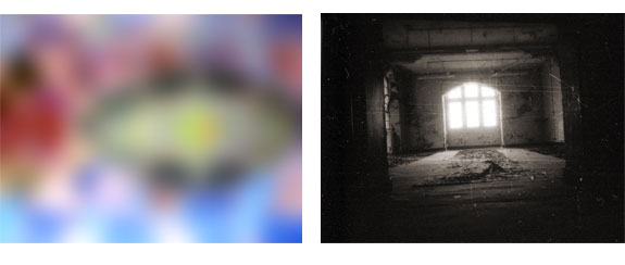
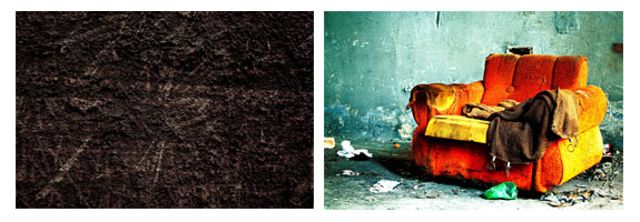
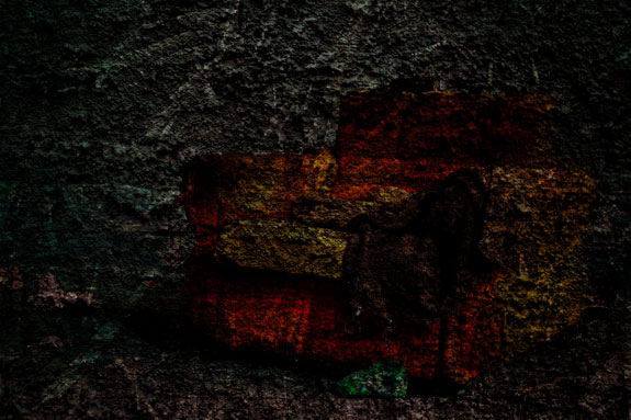
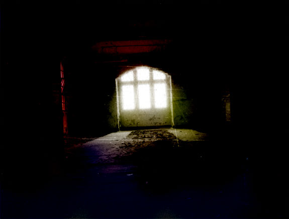
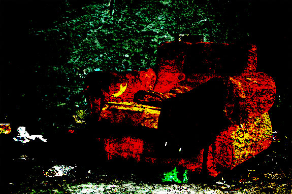
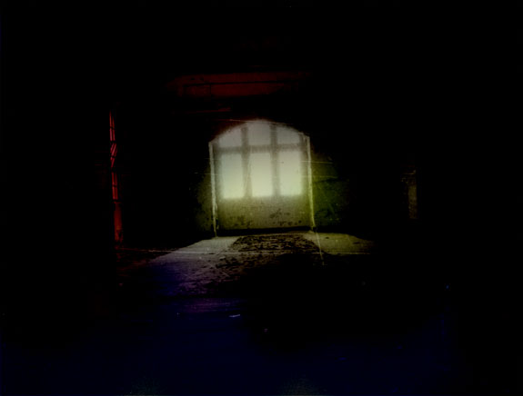
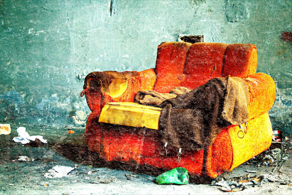
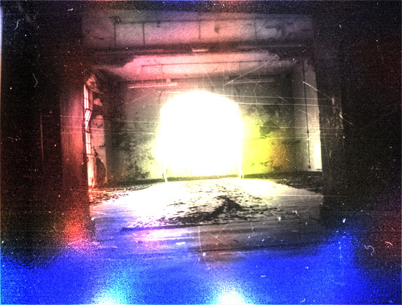
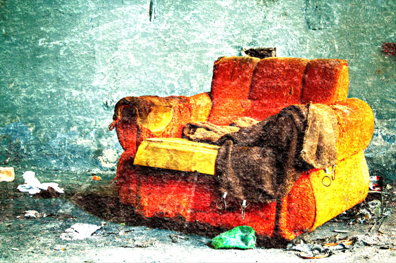
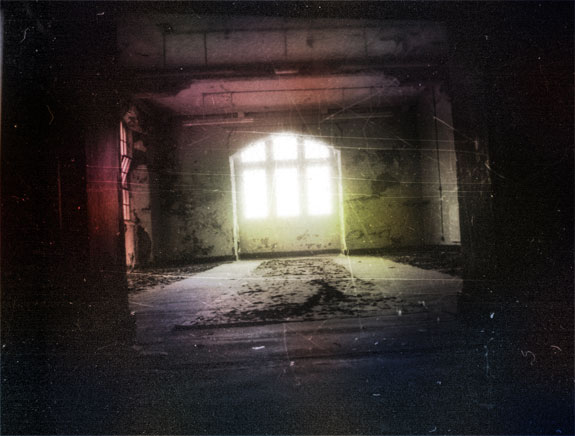
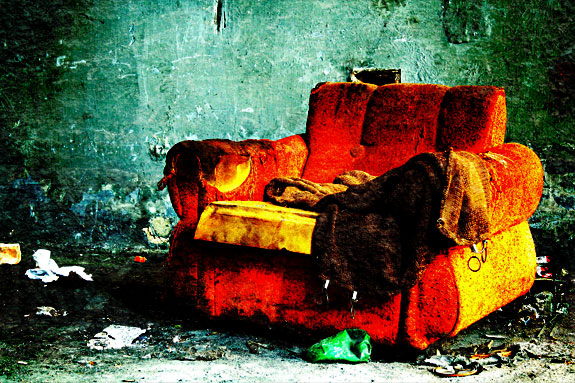
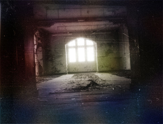
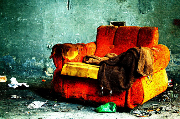
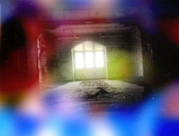
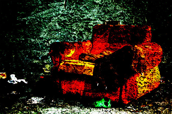
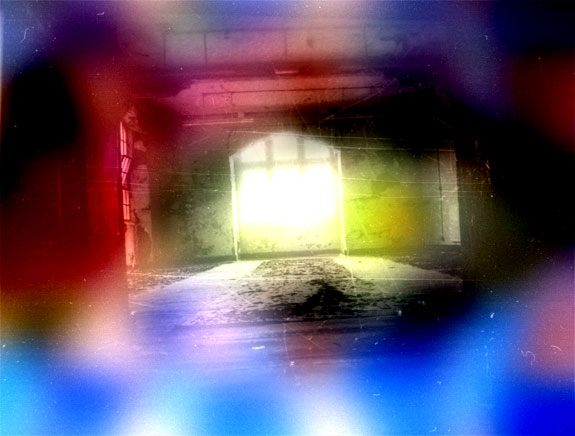
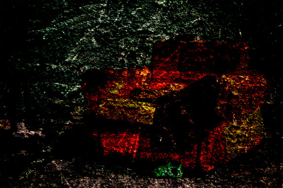
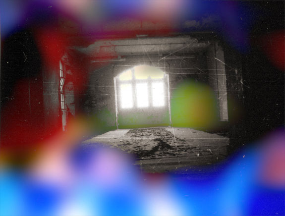
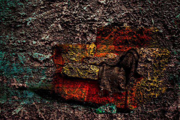
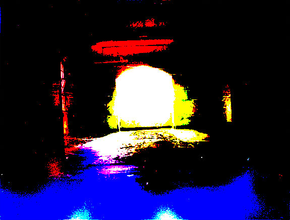
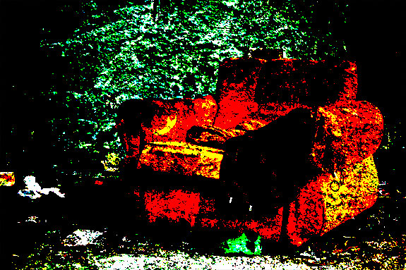
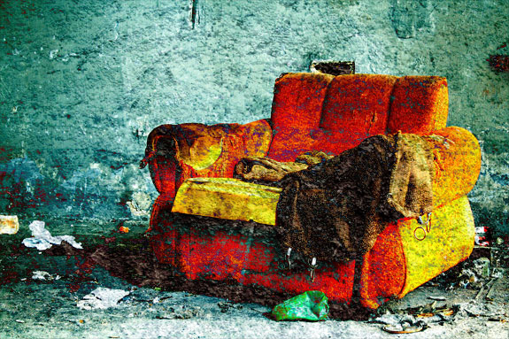
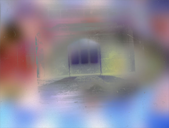
I decided to use two different examples for this demonstration. The first gives you an example of a simple photo with a complex and colorful texture while the second gives you a complex photo with a simple texture. This should give you a better visual of exactly what each mode does.
Remember that to get better results you can also adjust the opacity of the upper layer.
Basic Modes
Normal
Normal edits or paints each pixel to make it the result color. Basically, we aren’t getting any kind of effect here since both of our images are fully opaque. We’re just seeing the image on the upper layer. This is the default mode for every new layer.
Dissolve
Dissolve edits or paints each pixel to make it the result color. However, the result color is a random replacement of the pixels with the base color or the blend color, depending on the opacity at any pixel location. Dissolve only effects images with semi-transparent pixels, if the entire layer is opaque (as our images are) it will have no effect. This isn’t an option I ever use and figure most other designers are the same.
Darken Modes
Each of these blend modes gives the effect of darkening the image. You’ll notice that the darken modes tend to work better for the simple photo / complex texture combination.
Darken
Darken looks at the color information in each channel and selects the base or blend color – whichever is darker – as the result color. Pixels lighter than the blend color are replaced, and pixels darker than the blend color do not change.
Multiply
Multiply looks at the color information in each channel and multiplies the base color by the blend color. The result color is always a darker color. Multiplying any color with black produces black. Multiplying any color with white leaves the color unchanged.
Color Burn
Color Burn looks at the color information in each channel and darkens the base color to reflect the blend color by increasing the contrast. Blending with white produces no change.
Linear Burn
Linear Burn looks at the color information in each channel and darkens the base color to reflect the blend color by decreasing the brightness. Blending with white produces no change.
Lighten Modes
Each of these blend modes gives the effect of lightening the image. You’ll notice that the lighten modes tend to work better for the complex photo / simple texture combination.
Lighten
Lighten looks at the color information in each channel and selects the base or blend color – whichever is lighter – as the result color. Pixels darker than the blend color are replaced, and pixels lighter than the blend color do not change.
Screen
Screen looks at each channel’s color information and multiplies the inverse of the blend and base colors. The result color is always a lighter color. Screening with black leaves the color unchanged. Screening with white produces white. The effect is similar to projecting multiple photographic slides on top of each other.
Color Dodge
Color Dodge looks at the color information in each channel and brightens the base color to reflect the blend color by decreasing the contrast. Blending with black produces no change.
Linear Dodge (Add)
Linear Dodge (Add) looks at the color information in each channel and brightens the base color to reflect the blend color by increasing the brightness. Blending with black produces no change.
Contrast Modes
Each of these blend modes both darken and lighten aspects of the image, boosting the contrast.
Overlay
Overlay multiplies or screens the colors, depending on the base color. Patterns or colors overlay the existing pixels while preserving the highlights and shadows of the base color. The base color is not replaced, but mixed with the blend color to reflect the lightness or darkness of the original color.
Soft Light
Soft Light darkens or lightens the colors, depending on the blend color. The effect is similar to shining a diffused spotlight on the image. If the blend color (light source) is lighter than 50% gray, the image is lightened as if it were dodged. If the blend color is darker than 50% gray, the image is darkened as if it were burned in. Pure black or white produces a distinctly darker or lighter area, but does not result in pure black or white.
Hard Light
Hard Light multiplies or screens the colors, depending on the blend color. The effect is similar to shining a harsh spotlight on the image. If the blend color (light source) is lighter than 50% gray, the image is lightened, as if it were screened. This is useful for adding highlights to an image. If the blend color is darker than 50% gray, the image is darkened, as if it were multiplied. This is useful for adding shadows to an image. Pure black or white results in pure black or white.
Vivid Light
Vivid Light burns or dodges the colors by increasing or decreasing the contrast, depending on the blend color. If the blend color (light source) is lighter than 50% gray, the image is lightened by decreasing the contrast. If the blend color is darker than 50% gray, the image is darkened by increasing the contrast.
Linear Light
Linear Light burns or dodges the colors by decreasing or increasing the brightness, depending on the blend color. If the blend color (light source) is lighter than 50% gray, the image is lightened by increasing the brightness. If the blend color is darker than 50% gray, the image is darkened by decreasing the brightness.
Pin Light
Pin Light replaces the colors, depending on the blend color. If the blend color (light source) is lighter than 50% gray, pixels darker than the blend color are replaced, and pixels lighter than the blend color do not change. If the blend color is darker than 50% gray, pixels lighter than the blend color are replaced, and pixels darker than the blend color do not change. This is useful for adding special effects to an image.
Hard Mix
Hard Mix adds the red, green and blue channel values of the blend color to the RGB values of the base color. If the resulting sum for a channel is 255 or greater, it receives a value of 255; if less than 255, a value of 0. Therefore, all blended pixels have red, green, and blue channel values of either 0 or 255. This changes all pixels to primary colors: red, green, blue, cyan, yellow, magenta, white, or black.
Comparative Modes
Each of these blend modes compare the two layers looking for areas that are identical in both.
Difference
Difference looks at the color information in each channel and subtracts either the blend color from the base color or the base color from the blend color, depending on which has the greater brightness value. Blending with white inverts the base color values; blending with black produces no change.
Exclusion
Exclusion creates an effect similar to but lower in contrast than the Difference mode. Blending with white inverts the base color values. Blending with black produces no change.

PSD File DownloadYou can download the PSD File for this tutorial via the VIP Members Area for only $6.95/Month (or less)! You will not only get this PSD File, but also 100+ other PSD Files + Extra Goodies + Exclusive Photoshop tutorials there. Signup now and get exclusive :) Find out more about the VIP Members Areas
OK Let’s get started!To complete this tutorial, you will need the following stocks:Cloud BrushSmoke BrushHot Air BalloonStep 1Create a new document sized 1400px * 700px, grab the Gradient Tool and fill the background layer with a light blue gradient:
Click to enlarge the following screenshot to reveal the colour code:
Use the cloud brush set you downloaded, paint some white cloud on a new layer and we will use this as our background:
Step 2We will type some texts onto our canvas, I used the “Lucida Handwriting” font that comes with Photoshop:
Load the smoke brush into Photoshop and use the following set:
Press “F5″ to bring up the brush options window, apply the following setting:Shape Dynamics
Make sure you tick the “Smoothing” and “Protect Texture” option.Use the brush, gently paint over the text as shown below, adjust the brush size accordingly:
Turn off the original text layer, and you will have the following effect:
Then on this newly painted cloud layer, apply the following “Bevel and Emboss” layer blending effect:
and here is the effect so far:
Step 3We will add some retouches to this effect. To make text slightly sharpen, we flatten the image and apply the following “Unsharpen Mask” filter (Filter > Sharpen > Unsharpen Mask):
We can paint some cloud under the text, just to make the text look like floating above the cloud:
Load the hot air balloon PSD File into Photoshop and add some hot air balloons into the image:
Finally we can use the same brush in step 2 to add some extra cloud texture around the text:
and here is my final effect: (click to enlarge)