Working with 3D Images in Adobe Photoshop CS6


This lesson will take about 90 minutes to complete. Copy the Lesson12 folder onto your hard drive if you have not already done so. As you work on this lesson, you’ll preserve the start files. If you need to restore the start files, copy them again from the Adobe Photoshop CS6 Classroom in a Book DVD.
Image
Traditional 3D artists spend hours, days, and weeks creating photo-realistic images. The 3D capabilities in Photoshop let you create sophisticated, precise 3D images easily—and you can change them easily, too.

Getting started

This lesson explores 3D features, which are available only if OpenGL 2.0 is supported by your video card and enabled on your computer. To learn about your video card, choose Edit > Preferences > Performance (Windows) or Photoshop > Preferences > Performance (Mac OS). Information about your video card is in the Graphics Processor Settings area of the dialog box.
In this lesson, you’ll create a three-dimensional scene for a wine advertisement. First, you’ll view the finished scene.
  1. Start Photoshop, and then immediately hold down Ctrl+Alt+Shift (Windows) or Command+Option+Shift (Mac OS) to restore the default preferences. (See “Restoring default preferences” on page 4.)
  2. When prompted, click Yes to delete the Adobe Photoshop Settings file.
  3. Choose File > Browse In Bridge to open Adobe Bridge.
  4. In Bridge, click Lessons in the Favorites panel. Double-click the Lesson12 folder in the Content panel.
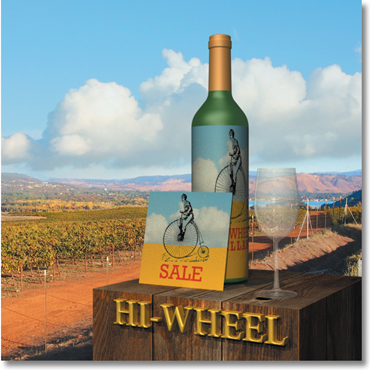
  5. View the 12End.psd file in Bridge. A three-dimensional wine bottle, wine glass, and sale card sit atop a wooden box with 3D lettering.
  6. Double-click the 12End.mp4 file to view the movie in which light has been animated to simulate a sunrise. When you’re done viewing the movie, exit QuickTime.
  7. Double-click the 12Start.psd file to open it in Photoshop.
The file contains an image of a vineyard, a black background layer, and two additional layers.
2. Creating a 3D shape from a layer

Vector Drawing Techniques in Adobe Photoshop CS6


 you’ll learn how to do the following:
  • Differentiate between bitmap and vector graphics.
  • Draw straight and curved paths using the Pen tool.
  • Convert a path to a selection, and convert a selection to a path.
  • Save paths.
  • Draw and edit shape layers.
  • Draw custom shapes.
  • Import and edit a Smart Object from Adobe Illustrator.
Image
This lesson will take about 90 minutes to complete. Copy the Lesson08 folder onto your hard drive if you haven’t already done so. As you work on this lesson, you’ll preserve the start files. If you need to restore the start files, copy them from the Adobe Photoshop CS6 Classroom in a Book DVD.
Image
Unlike bitmap images, vector images retain their crisp edges when you enlarge them to any size. You can draw vector shapes and paths in your Photoshop images and add vector masks to control what is shown in an image.

About bitmap images and vector graphics

Before working with vector shapes and vector paths, it’s important to understand the basic differences between the two main categories of computer graphics: bitmap images and vector graphics. You can use Photoshop to work with either type of graphic; in fact, you can combine both bitmap and vector data in an individual Photoshop image file.
Bitmap images, technically called raster images, are based on a grid of dots known as pixels. Each pixel is assigned a specific location and color value. In working with bitmap images, you edit groups of pixels rather than objects or shapes. Because bitmap graphics can represent subtle gradations of shade and color, they are appropriate for continuous-tone images such as photographs or artwork created in painting programs. A disadvantage of bitmap graphics is that they contain a fixed number of pixels. As a result, they can lose detail and appear jagged when scaled up onscreen or printed at a lower resolution than they were created for.
Vector graphics are made up of lines and curves defined by mathematical objects calledvectors. These graphics retain their crispness whether they are moved, resized, or have their color changed. Vector graphics are appropriate for illustrations, type, and graphics such as logos that may be scaled to different sizes.
Figure 1 Logo drawn as vector art
Figure 2 Logo rasterized as bitmap art
2. About paths and the Pen tool

Masks and Channels in Adobe Photoshop CS6


Masks and Channels in Adobe Photoshop CS6


Contents

  1. 6. Masks and Channels
  2. Getting started
  3. Creating a mask
  4. Refining a mask
  5. Creating a quick mask
  6. Manipulating an image with Puppet Warp
  7. Working with channels

Article Description

Learn how to create a mask to remove a subject from a background, refine a mask to include complex edges, create a quick mask to make changes to a selected area, edit a mask using the Properties panel, manipulate an image using Puppet Warp, save a selection as an alpha channel, view a mask using the Channels panel, load a channel as a selection, isolate a channel to make specific image changes.

From the book

Adobe Photoshop CS6 Classroom in a Book
$43.99 (Save 20%)
Note: This excerpt does not include the lesson files. The lesson files are available with purchase of the book.
Lesson overview
In this lesson, you’ll learn how to do the following:
  • Create a mask to remove a subject from a background.
  • Refine a mask to include complex edges.
  • Create a quick mask to make changes to a selected area.
  • Edit a mask using the Properties panel.
  • Manipulate an image using Puppet Warp.
  • Save a selection as an alpha channel.
  • View a mask using the Channels panel.
  • Load a channel as a selection.
  • Isolate a channel to make specific image changes.
Image
This lesson will take about an hour to complete. Copy the Lesson06 folder onto your hard drive if you haven’t already done so. As you work on this lesson, you’ll preserve the start files. If you need to restore the start files, copy them from the Adobe Photoshop CS6 Classroom in a BookDVD.
Image
Photography © Image 
Use masks to isolate and manipulate specific parts of an image. The cutout portion of a mask can be altered, but the area surrounding the cutout is protected from change. You can create a temporary mask to use once, or you can save masks for repeated use.

Working with masks and channels

Photoshop masks isolate and protect parts of an image, just as masking tape protects window panes or trim from paint when a house is painted. When you create a mask based on a selection, the area you haven’t selected is masked, or protected from editing. With masks, you can create and save time-consuming selections and then use them again. In addition, you can use masks for other complex editing tasks—for example, to apply color changes or filter effects to an image.
In Photoshop, you can make temporary masks, called quick masks, or you can create permanent masks and store them as special grayscale channels called alpha channels. Photoshop also uses channels to store an image’s color information. Unlike layers, channels do not print. You use the Channels panel to view and work with alpha channels.
A key concept in masking is that black hides and white reveals. As in life, rarely is anything black and white. Shades of gray partially hide, depending on the gray levels (255 is the value for black, hiding artwork completely; 0 is the value for white, revealing artwork completely).

Adobe Photoshop CS6 Classroom


Adobe Photoshop CS6 Classroom


Note: This excerpt does not include the lesson files. The lesson files are available with purchase of the book.

Lesson overview

In this lesson, you’ll learn how to do the following:

Understand image resolution and size.
Open and edit an image in Camera Raw.
Adjust the tonal range of an image.
Straighten and crop an image.
Paint over a color with the Color Replacement tool.
Adjust the saturation of isolated areas of an image using the Sponge tool.
Use the Clone Stamp tool to eliminate an unwanted part of an image.
Use the Spot Healing Brush tool to repair part of an image.
Use the content-aware Patch tool to remove blemishes.
Apply the Unsharp Mask filter to finish retouching photos.
Save an image file for use in a page layout application.


This lesson will take about an hour to complete. Copy the Lesson02 folder onto your hard drive if you haven’t already done so. As you work on this lesson, you’ll preserve the start files. If you need to restore the start files, copy them from the Adobe Photoshop CS6 Classroom in a Book DVD.


Adobe Photoshop includes a variety of tools and commands for improving the quality of a photographic image. This lesson steps you through the process of acquiring, resizing, and retouching a photo intended for a print layout. The same basic workflow applies to web images.

Strategy for retouching

How much retouching you do depends on the image you’re working on and your goals for it. For many images, you can achieve your desired outcome with just a few clicks in Adobe Camera Raw, which is installed with Adobe Photoshop. For others, you may start in Camera Raw to adjust the white point, for example, and then move on to Photoshop for more advanced retouching, such as applying filters to selected parts of an image.

Organizing an efficient sequence of tasks

Most retouching procedures follow these general steps:

Duplicating the original image or scan; working in a copy of the image file makes it easy to recover the original later if necessary
Ensuring that the resolution is appropriate for the way you’ll use the image
Cropping the image to final size and orientation
Repairing flaws in scans of damaged photographs (such as rips, dust, or stains)
Adjusting the overall contrast or tonal range of the image
Removing any color casts
Adjusting the color and tone in specific parts of the image to bring out highlights, midtones, shadows, and desaturated colors
Sharpening the overall focus of the image
Usually, you should complete these processes in the order listed. Otherwise, the results of one process may cause unintended changes to other aspects of the image, making it necessary for you to redo some of your work.

NOTE

In Lesson 1, you used an adjustment layer, which gives you great flexibility to experiment with different correction settings without risking damage to the original image.

Adjusting your process for different intended uses

The retouching techniques you apply to an image depend in part on how you’ll use the image. Whether an image is intended for black-and-white publication on newsprint or for full-color online distribution affects everything from the resolution of the initial scan to the type of tonal range and color correction that the image requires. Photoshop supports the CMYK color mode for preparing an image to be printed using process colors, as well as RGB and other color modes for web and mobile authoring.

To illustrate one application of retouching techniques, this lesson takes you through the steps of correcting a photograph intended for four-color print publication.

For more information about CMYK and RGB color modes, see Lesson 14, “Producing and Printing Consistent Color.”

Design an Interesting Cloud Text Effect in Photoshop


Design an Interesting Cloud Text Effect in Photoshop
Posted on November 25th, 2012 in Text Effects.
In this tutorial, I will show you the steps I took to Design an Interesting Cloud Text Effect in 3 Easy Steps in Photoshop. We will mainly use custom brushsets and utilise brush options to achieve this text effect. This is a beginner level tutorial, have a try :)
Note: The Photoshop tutorial is done in CS6 – therefore some screenshot may have slighting different layout as in the earlier version. Some brushes are exclusive to Photoshop CS6.
Here is a preview of the final effect I have for this tutorial: (click to enlarge)
cloud text flatten1 500x250 Design an Interesting Cloud Text Effect in Photoshop

PSD File Download

You can download the PSD File for this tutorial via the VIP Members Area for only $6.95/Month (or less)! You will not only get this PSD File, but also 100+ other PSD Files + Extra Goodies + Exclusive Photoshop tutorials there. Signup now and get exclusive :) Find out more about the VIP Members Areas
vip sign up 250 Design an Interesting Cloud Text Effect in Photoshop
OK Let’s get started!
To complete this tutorial, you will need the following stocks:

Step 1

Create a new document sized 1400px * 700px, grab the Gradient Tool and fill the background layer with a light blue gradient:
1 grad 500x159 Design an Interesting Cloud Text Effect in Photoshop
Click to enlarge the following screenshot to reveal the colour code:
1 fill 500x249 Design an Interesting Cloud Text Effect in Photoshop
Use the cloud brush set you downloaded, paint some white cloud on a new layer and we will use this as our background:
1 paint 500x249 Design an Interesting Cloud Text Effect in Photoshop

Step 2

We will type some texts onto our canvas, I used the “Lucida Handwriting” font that comes with Photoshop:
2 font 500x205 Design an Interesting Cloud Text Effect in Photoshop
Load the smoke brush into Photoshop and use the following set:
2 brush Design an Interesting Cloud Text Effect in Photoshop
Press “F5″ to bring up the brush options window, apply the following setting:
Shape Dynamics
2 shape dyn Design an Interesting Cloud Text Effect in Photoshop
Make sure you tick the “Smoothing” and “Protect Texture” option.
Use the brush, gently paint over the text as shown below, adjust the brush size accordingly:
2 paint 500x424 Design an Interesting Cloud Text Effect in Photoshop
2 paint 2 500x243 Design an Interesting Cloud Text Effect in Photoshop
Turn off the original text layer, and you will have the following effect:
2 effect1 500x168 Design an Interesting Cloud Text Effect in Photoshop
Then on this newly painted cloud layer, apply the following “Bevel and Emboss” layer blending effect:
2 bevel 500x359 Design an Interesting Cloud Text Effect in Photoshop
and here is the effect so far:
2 effect 2 500x163 Design an Interesting Cloud Text Effect in Photoshop

Step 3

We will add some retouches to this effect. To make text slightly sharpen, we flatten the image and apply the following “Unsharpen Mask” filter (Filter > Sharpen > Unsharpen Mask):
3 unsharp Design an Interesting Cloud Text Effect in Photoshop
We can paint some cloud under the text, just to make the text look like floating above the cloud:
3 paint 500x202 Design an Interesting Cloud Text Effect in Photoshop
3 paint 2 500x239 Design an Interesting Cloud Text Effect in Photoshop
Load the hot air balloon PSD File into Photoshop and add some hot air balloons into the image:
3 balloon 500x233 Design an Interesting Cloud Text Effect in Photoshop
Finally we can use the same brush in step 2 to add some extra cloud texture around the text:
3 cloud over 500x152 Design an Interesting Cloud Text Effect in Photoshop
and here is my final effect: (click to enlarge)
cloud text flatten1 500x250 Design an Interesting Cloud Text Effect in Photoshop
That’s it for this tutorial! Hope you enjoy it and find it useful! Till next time, have a great day!

THE ART OF SUBTRACTION


Figure 1: Bell Rock
Figure 2: Bell Rock 
Bell Rock is one of the classic rock structures in Sedona, Arizona. While visiting, I hiked around the area and got the snapshots shown in Figures 1 -- 3. While the snapshots were shot under the midday sun, it wasn't hard to image the emotion that would be created under the appropriate lighting: gorgeous, saturated, red spires glowing in the last few rays of the setting sun -- all starkly contrasted against a deep blue sky.

THE ART OF SUBTRACTION


Supposedly, when Michelangelo was asked how he had made the magnificent statue of David, he replied, “I just removed everything that wasn’t David”.
THE ART OF SUBTRACTION

When I look at the work of other photographers, there are always a few exceptional images that really stand out. Most of the images that I look at get only a quick glance. However, when I come to one of those exceptional images, everything else seems to fade into the distance. I find my eyes roaming through the image, from point to point, taking in all aspects of the photograph. Often, I find myself going back to those same images to view them again.
I have often asked myself what makes those images so powerful. For me, the answer has become quite clear -- every one of those exceptional images communicates a strong emotion. I consider this to be the driving force behind the images. I believe that this is so important that I consider it the number one rule of photography:

ALL GREAT PHOTOGRAPHY IS ABOUT COMMUNICATING AN EMOTION

If this is the most important rule in photography (for me at least), what is the next most important rule? For me, the next rule flows from the first:

STRIP EVERYTHING OUT OF AN IMAGE THAT DOES NOT COMMUNICATE THE EMOTION!

So, photographers have something to learn from Michelangelo. To create great art, all one has to do is remove everything that is not great art. In terms of photography, all one has to do is remove everything that does not in some way strengthen the emotion. In essence, this is the art of subtraction.
WHY IS THIS SO IMPORTANT

A natural response might be to ask why this is so important.
Have you ever had some really great lemonade? A tall glass filled with ice on a hot summer day. The lemonade was great, and the ice made it even better. The ice complimented the lemonade; it seemed to strengthen the taste somehow. Have you ever left a glass of that icy lemonade sitting in the sun too long? By the time that you got back to the lemonade, the ice had melted. What did you have now? Luke warm, weak lemonade. And what did you do with that lemonade? Threw it out, most likely. Why? Because the water from the ice cubes had diluted the taste of the lemonade.
Similarly, items in an image that help the image communicate its emotion strengthen the image (just like the ice strengthened the taste of the lemonade). All other items serve only to dilute the image (as the melted ice cubes diluted the lemonade). In short, all things that do not strengthen the emotion of an image weaken the image.
EMOTION AND COMPOSITION

It all comes down to emotion followed by composition. Emotion is the driving force. Attempting to identify and capture an emotion is the one thing that should lead everything else in the photographic process.
Composition is what allows a photographer to capture the emotion. It is a matter of taking a viewpoint and framing the image in such a way that everything in the image strengthens the emotion.
IDENTIFY, ADD, AND SUBTRACT

So, how does one go about creating an image that communicates an emotion? For me, it comes down to a three step process: 1) identify the emotion, 2) identify the elements that strengthen the emotion and add them to the image, and 3) subtracting everything else from the image.
Now, unfortunately, this is not something that one can teach like one would teach how to use Levels or Curves. Neither I, nor anyone else, can teach someone how to logically identify and analyze the emotional impact in a scene. In fact, this is contradictory. Emotions are something that we feel. Trying to teach someone how to logically analyze what must be felt is illogical. Each photographer must develop this ability himself. However, what one can do is show examples. This is the approach that I have chosen in this article. Three examples of how I applied the art of subtraction will be shown.
BELL ROCKments that supported this emotion were clear:
  • The shape of the rock. When shot from the proper angle, the rock was almost symmetric.
  • The spires at the top of the rock. The vertical lines of the spires contrasted strongly with the horizontal lines of the lower rock.
  • The blue sky. This provided a strong contrast to make the red rock stand out.
  • The interplay of light and shadow. This was absolutely critical. If the image was shot at the proper time, the shadows would fall in such a manner as to isolate the spires from the rest of the image and make them stand out in a dramatic manner.
  • Moon. I was aware that the moon would be rising that evening just as the sun was setting. It was hoped that the moon could be caught just as it started to rise above the rock.
Figure 3: Bell Rock
The elements that did not support the emotion were also clear.
  • The other mountains in the background. These mountains only served to compete with Bell Rock and thus weakened the image.
  • The vegetation. The vegetation was very distracting. It contrasted with the red rock and would draw the attention away from the rock if too much of it was included in the image.
  • Foreground. In this image, the foreground served no useful purpose. It would only make Bell Rock look smaller.
The subtraction process required a careful positioning of the camera. A hike around the mountain had identified a viewpoint that gave the rock its most symmetrical appearance. Once this viewpoint was discovered, the camera was positioned in such a manner that the other mountains could not be seen in the background. Furthermore, the image was composed such that the foreground, and most of the vegetation, was eliminated from the image. Lastly, the rock was cropped fairly close. This removed any distracting detail around the mountain. This subtraction process isolated the rock from its distracting surroundings and made it appear as a very dominating formation (which it is).
Once the subtraction process had eliminated the undesirable elements, the timing of the shot allowed the elements that supported the emotion to come to full force. The shot was taken during the last few minutes of the setting sun. This caused the rock that was directly illuminated to turn a very saturated red. This same light also caused the sky to become deep blue. This contrast in color made Bell Rock stand out. In addition, the shot was taken when the shadows had just reached the dividing line between the horizontally layered, lower rock and the vertical spires. This timing also put the moon in position just above the rock (as was desired). The final image can be seen in Figure 4. 
Figure 4: Bell Rock Final Image

ZION

Figure 5: Zion
Figure 6: Zion
Figure 7: Zion
Zion is another location that has beautiful rock. Figures 5 -- 7 show snapshots that were taken as I explored one area of the canyon. The emotion that the area elicited was one of an eloquent beauty. This was supported by:
  • The graceful lines. These were formed by the sedimentary nature of the rock.
  • The color of the rock. This color enhanced the curved lines.
It was clear that the best image would be a very simple composition, one that focused the attention on the graceful nature of the lines without a lot of extraneous detail.
However, there were a number of elements that did not support the emotion.
  • Much of the rock had numerous, small patches of what appeared to be a dark, moss like growth that gave the rock a dirty appearance (some of this can be seen in Figure 5).
  • Debris. Much of the area had rock debris strewn all around.
  • Plants. Many plants had found a foothold in the rock.
Again, the subtraction process required a careful positioning of the camera. An area of rock was located that had both graceful lines and an extremely clean surface free of plants and the moss like growth. The camera was positioned at a section such that shallow, S shaped lines flowed directly at the camera. This composition managed to eliminate all of the distracting elements from the image. Then, the camera was slightly adjusted to compose the image so that it included just a small amount of the rock debris in the corner. This rock broke the pattern of the lines and contrasted with them. This emphasized the lines and made them even a stronger element. In essence, the composition was set up to subtract out everything except the lines and the few rocks that enhanced the lines. The final critical element was the light. It was necessary to wait until mid morning when the sunlight reflected off the nearby red rock. This reflected light picked up the red color of the rock before illuminating the subject. This enhanced the red color of the rock that was being photographed. The final image is shown in Figure 8.
Figure 8: Zion Final Image

WATERFALL

Figure 9: Waterfall
Figure 10: Waterfall
Waterfalls are a favorite subject of many photographers. The waterfall shown in Figures 9 and 10 was found in a canyon in the Sierra Mountains. The canyon was beautiful, and a number of different shots could have been taken. However, I was looking for something different than what is seen in these two figures. I was interested in creating an image that had a more up close and personal emotional feel to it. Three elements were needed:
  • Cascading water. One of the things that made this series of waterfalls so attractive was the way the water cascaded down the rock forming multiple lines of flow.
  • Up close. An up close shot was needed that would emphasis the cascading water.
  • A foreground element that accentuated the cascading water.
Identifying what to subtract was easy. Essentially, anything other than the cascading water and the foreground element needed to be subtracted.
Some scrambling along the long series of falls (Figures 9 and 10 show only a small portion of the series of waterfalls) resulted in the discovery of a small waterfall that had just what was desired: beautiful cascading water and a great foreground element. The image was shot up close (the water spray was a challenge). The flowers in the lower right corner provide a contrast that grabs the viewer's attention. Normally, that might not be a good thing. After all, this image is supposed to be about the cascading water. However, the flowers are right next to the log. This log directs the viewer's attention straight to the water. Thus, the combination of the flowers and the log actually serve to strengthen the image.
What are not seen are all the distracting elements that surrounded the waterfall that were subtracted from the image. For instance, there is a fallen tree to the right of the waterfall that leans up against the rock formation that the water tumbles down. Had this tree been included in the image, it would have served to lead the viewer's eye out of the image. In addition, on the left side of the waterfall is a flat rock area with my photo partner sound asleep. The final image is shown in Figure 11.
Figure 11: Waterfall Final Image

THE POWER OF SUBTRACTION

As mentioned at the beginning of this article, when viewing other photographers work, I often see stunning images. The universal component of these images is that they have compositions where all of the distracting details have been eliminated. The photographers that created these images practiced the power of subtraction. The result is that all of the remaining elements in each image serve to strengthen the emotion of the image. Consequently, the viewer's attention is concentrated on that emotion to the exclusion of everything else.
On the other hand, I see many images that seem to communicate no emotion and that are cluttered with too many things. The interesting thing is that, sometimes, I look at those images and see that there was an opportunity to make a really good image -- if the emotion of the scene had been identified and the distracting elements subtracted from the image.
Many people, myself included, travel to locations hoping to find beautiful scenes to shoot. We think, "If I can just find that beautiful waterfall or grand scenic and include it in an image, I will have a great shot". The problem is, great images are determined as much by what is not in the shot as by what is. Photographers that have not learned this lesson are likely to be disappointed even when shooting in beautiful locations.
When we were in grade school, our teachers taught us how to subtract. Now, it is time for us to learn that skill all over again with our photography.