the popular and comprehensive series Photoshop CS6


The third part of the popular and comprehensive series Photoshop CS6 One-on-One follows industry pro Deke McClelland as he plunges into the inner workings of Adobe Photoshop. He shows how to adjust your color, interface, and performance settings to get the best out of your images and the most out of Photoshop, and explores the power of Smart Objects, Shadows/Highlights, and Curves for making subtle, nondestructive adjustments. The course dives into Camera Raw to experiment with the editing toolset there, and returns to Photoshop to discuss toning, blur, and blend modes. Deke also teaches tried-and-true methods for sharpening details and reducing noise, as well as creating quick and accurate selections with Quick Mask, Color Range, and Refine Edge commands.
Topics include:
Adjusting the color settings in Photoshop
Placing and blending Smart Objects in a scene
Transforming and warping vector objects
Correcting for lens distortion
Mitigating halos and enhancing contrast with Shadows/Highlights
Adding and editing points on a curve
Editing multiple images in Camera Raw
Creating a pro-quality sepia tone or quadtone
Colorizing with blend modes and opacity
Reducing and smoothing over noise
Creating depth-of-field effects with blur
Selecting with Color Range and Quick Mask
Perfecting a mask with Refine Edge
Drawing paths with the Pen tool
Converting path outlines to vector masks
show more

Calculating with the Add mode


We are having problems maintaining color consistency for digital output (as well as color shifts on proofs) due to the recent CS6 Pantone Plus color library update.
We have had to remove the updated libraries and replace them with the previous versions due to the unexpected color differences on output.
Has anyone else been having problems with the Plus update?
Is there a good explanation of why it was changed in the first place? We want to make sure we're not missing a good reason for the revised color libraries.
Chuck
Pantone Plus (Solid) color libraries are now based on Lab value compared to previous one using CMYK as default in Illustrator And InDesign.
Lab values help to keep consistency between Photoshop, Illustrator and InDesign when you want to convert to CMYK.
Each application are doing a color transform like this: Source (Lab) -> Destination (CMYK or RGB) using the related working color space defined in the color setings preferences.
This make sure that when you convert to CMYK for example, the best match will be made for the current CMYK working space you are using.
If you set all your color setings the same within each application, you will get the same CMYK values.

Can you tel me more about the problem you have with the new Pantone Plus libraries?

I jumped to get AI CS6 as soon as it came out- and now, honestly, I'm regretting it.
We do large digital output, and PMS spot colors are critical. I'm finding that anything I copy into a new doc, converts to lab- and I have to manually plug in the CMYK mixes for the spot colors. It's taking a ton of time that I wouldnt otherwise have;
If you find the magic bullet, please share it with the class.


Using the Scale and Offset values


If you find that your whole animation is a bit too long or too short, or you just want to offset it by a few frames, you can do so with the Sequence commands. These commands give you control over animation by offsetting or scaling (stretching or shrinking) the motion of all or selected objects, or even just the marked parameters of selected objects.
You can offset, scale, or retime function curve animation, including fcurves in animation layers.
TipYou can also use the dopesheet or select all keys in the timeline to scale and offset animation for the whole scene or for selected objects. Using the dopesheet may be useful if you encounter some problems with animation not scaling properly with the Sequence commands. For information, see Scaling Regions of Keys.
You can choose to either scale and offset using explicit values, or else you can retime an animation by fitting it into a specified frame range. For example, you can easily retime an animation that used to go from frame 1 to 100 so that it now goes from frame 30 to 50. You can also reverse an animation easily: for example, instead of going from frame 1 to 100, it goes from frame 100 to 1.
To offset, scale, or retime animation
Do one of the following, choosing the corresponding Animation  Sequence Animation command from the Animation panel:

To offset, scale, or retime animation for only marked parameters, select the objects and mark the parameters whose animation you want to change, then choose Sequence Animation  Marked Parameters.
For information on marking parameters, see Marking Parameters for Animation.
or
To offset, scale, or retime all animation for selected objects, select the objects whose animation you want to change and choose Sequence Animation  All Parameters on Selection.
or
To offset, scale, or retime all animation in the scene, make sure that nothing is selected and choose Sequence Animation  All Scene.
In the Sequence dialog box that appears, select the appropriate Input Method:

A
Select Offset and Scale as the Input Method to either offset or scale the animation. Then follow the steps in Offsetting or Scaling Animation.
 
or
B
Select Retime (Before/After Range) as the Input Method to retime the animation.
Then follow the steps in Retiming Animation.
Tip
The main timeline's start and end frames are not updated automatically if the resulting scaled/offset/retimed animation goes outside the current frame range.
To view your entire animation, you must either reset the start and end frames on the timeline or open the animation editor to view the scaled or offset function curves.
Offsetting or Scaling Animation
Select Offset and Scale as the Input Method in the Sequence dialog box.
With the Offset, specify the number of frames by which to offset the animation.
Enter a Scale value by which to stretch or shrink the animation.
This value is the number by which the current length of the scene (or frame range) is multiplied. For example, using a value of 3 here makes a 100-frame scene 300 frames long.
When you scale you can also choose to Pivot the animation at a certain frame, which lets you reverse an animation at that point.
Specify the frame range you want to affect by setting the Start and End Frame values for the Affected Scale & Offset Range.
Select the Affected Items you want to scale or offset from the Sequence Mode list. You can choose from function curves, clips in the animation mixer, or all animation sources, as well as a combination of these types.
As well, you can scale or offset the fcurves in either all or just the current animation layer.
In this image, the Selected fcurve has been scaled to twice its size. The ghosted fcurve in gray shows the original fcurve's size.

In this image, the Selected fcurve has been offset by about 20 frames. The ghosted fcurve shows the original fcurve's position.

Retiming Animation
You can retime an animation by fitting it into a specified frame range. For example, you can easily retime an animation that used to go from frame 1 to 100 so that it now goes from frame 30 to 50. You can also reverse an animation easily: for example, instead of going from frame 1 to 100, it goes from frame 100 to 1.
Select Retime (Before/After Range) as the Input Method in the Sequence dialog box.
Specify the Retime Range Before values, which are the frames of animation you want to use for retiming.
Specify the new frame range in which you want your animation to fit by setting the Retime Range After frame values.
Select the Affected Items you want to retime from the Sequence Mode list. You can choose from function curves, clips in the animation mixer, or all animation sources, as well as a combination of these types.
As well, you can retime the fcurves in either all or just the current animation layer.
Below, the selected fcurve has been retimed so that a range of 125 frames in the middle of the sequence has been compressed to into a range of 80 frames. The ghosted fcurve in gray shows the original fcurve's size and shape.


Subtract blending modes


The Add and Subtract blending modes are available only for the Apply Image and Calculations commands.

Add

Adds the pixel values in two channels. This is a good way to combine nonoverlapping images in two channels.

Because higher pixel values represent lighter colors, adding channels with overlapping pixels lightens the image. Black areas in both channels remain black (0 + 0 = 0). White in either channel results in white (255 + any value = 255 or greater).

Add mode divides the sum of the pixel values by the Scale amount and then adds the Offset value to the sum. For example, if you wanted to find the average of the pixels in two channels, you would add them, divide by 2, and enter no Offset value.

The Scale factor may be any number between 1.000 and 2.000. Entering a higher Scale value darkens the image.

The Offset value lets you lighten or darken the pixels in the destination channel by any brightness value between +255 and -255. Negative values darken the image; positive values lighten the image.

Subtract

Subtracts the pixel values in the source channel from the corresponding pixels in the target channel. As with Add mode, the result is then divided by the Scale factor and added to the Offset value.

The Scale factor may be any number between 1.000 and 2.000. The Offset value lets you lighten or darken the pixels in the destination channel by any brightness value between +255 and -255.

1. Calculating a Hair Mask


1. Calculating a Hair Mask
Introducing the hair masking options 4m 18s
Calculating with the Add mode 5m 58s
Using the Scale and Offset values 3m 47s
Calculating with the Subtract mode 5m 19s
Enhancing a mask with Apply Image 4m 42s
Traditional blue screen masking 3m 7s
Painting in the missing details 4m 23s
Compositing dark hair 5m 47s
Creating an in-text reflection effect 4m 1s
2. Masking Dark Hair41m 43s
Creating a contrast mask 4m 34s
Cleaning up a base mask 5m 55s
Reinstating missing details 5m 12s
Building a second-pass mask 6m 30s
Bringing back the most fragile hairs 5m 17s
Smudging bad transitions 5m 19s
Painting in missing hairs 5m 6s
Matching the light source 3m 50s
3. Masking Light Hair51m 12s
Calculating blonde hair 4m 50s
Creating two contrasting iterations 3m 27s
Merging two iterations inside a mask 4m 44s
Performing selective edits with Dodge and Burn 5m 19s
Painting in Airbrush mode 4m 30s
Repairing details with a warped ellipse 6m 18s
Pulling a background with Apply Image 3m 57s
Blending clipped layers independently 6m 42s
Building a flame mask 7m 25s
Compositing and coloring the flame 4m 0s
4. Masking the Tough Stuff48m 16s
Making a first-pass calculation 4m 54s
Making a second-pass calculation 4m 32s
Refining and combining the two passes 5m 28s
Painting and editing the third-pass mask 6m 16s
Merging channels inside a mask 4m 5s
Cleaning up with Dodge and Brush 7m 41s
Adding the earring to the mask 4m 16s
Tweaking and integrating the hair 6m 1s
Restoring the mask's focus with History 5m 3s
Conclusion1m 17s
Next steps 1m 17s

blending modes practice

Blending Mode  Blending Modes in Photoshop and other 
Choosing a Blending Mode from the Layers Palette
Ad
Actions & Presetswww.rebeccalily.comProfessional Post Processing Tools for Photographers
In the screen shot here, you can see my layers palette with the base layer and the blend layer exactly as I have set it up for these examples. The Blending Mode is set from the menu at the top left of the layers palette.
When discussing blending modes, there is some basic terminology you should understand. I will be using these terms in my descriptions of each blending mode.
  • The base color is the starting color of the original image.
  • The blend color is the color being applied to the base image. In the examples I will show, you the blend source is a layer consisting of eight color blocks in varying levels of opacity. The blend color could also be applied with a painting tool.
  • The result color is what you get after combining a blend color with the base color using a blending mode.
In the screen shot here, you can see my layers palette with the base layer and the blend layer exactly as I have set it up for these examples. The Blending Mode is set from the menu at the top left of the layers palette. When a blending mode is applied to the layer above, it will change the appearance of the colors in the layer below.
I have created my blending example image using multiple colors, tones, and opacities in my blend layer, so you can see how these differences change the results of each blending mode in different ways. If you'd like to follow along with my examples in a larger format, you maydownload my layered example file in PSD format (7.33 MB ZIP) and adjust blending modes on your own screen. I would also encourage you to experiment with blending modes using your own images.
There are two blending modes which are not available for layers--Clear and Behind. For these blending modes, I have used different images for my examples.

Learn How to Mask Hair, Down to the Final Fragile Follicle, in Photoshop


Learn How to Mask Hair, Down to the Final Fragile Follicle, in Photoshop

My final video course of 2011 for the lynda.com Online Training Library is now live. Titled Photoshop Masking & Compositing: Hair, it lives up to its name, showing you how to mask and composite the most fragile of all photographic details, hair, in that most powerful of masking applications, Photoshop.

Photoshop Masking & Compositing: Hair
(Yes, I'm aware that the term "follicle" specifically refers to the root of the hair, not the part we see and therefore need to mask. It's all about the alliteration, dammit!)
My goal is to boost both your skills and your confidence. As well as pass along lots of useful, in-the-trenches techniques. All in just 3 hours and 6 minutes! Here's an illustrated outline of the four feature-rich chapters and the fun, challenging projects that accompany them:
Chapter 1, Calculating a Hair Mask. I start by introducing you to the best of Photoshop's hair-identification commands, Calculations and Apply Image. Then we'll review those commands specialized blend modes, Add and Subtract, as well as their refinement options, Scale and Offset. In the end, I'll show you how to hair a person captured against a blue screen or clear sky background, and set her against an aqueous backdrop, as pictured below.
Chapter 1, Calculating a Hair Mask
Chapter 2, Masking Dark Hair. In the next chapter, we'll take a look at ways to mask a dark-haired subject (which includes most people, btw) set against a busy background. You'll also see what to do when hairs and backgrounds interact with each other, as they almost invariably do. Mask in hand, we'll blend the model with a futurist backdrop, match the light sources, and paint in a few missing hairs using a Wacom tablet. The final effect appears below.
Chapter 2, Masking Dark Hair
Chapter 3, Masking Light Hair. Next, we'll focus on the more rare phenomenon of light hair. Specifically, I'll show you how to mask a blond-haired model into a vibrant backdrop. Plus, you'll see how to mask a translucent flame. As witnessed below, so the flame effect is a bit over the top. But I've never been of a fan of subtlety.
Chapter 3, Masking Light Hair
Chapter 4, Masking the Tough Stuff. In the last chapter, we'll take on the tough tough. Not only does the subject of the photo have tons of alternately thick hair---sometimes coarse, sometimes wispy---but she's set against a busy background, and her hairs are at once lighter, darker, and the same hue and saturation values as the details that surround them. Which makes for a daunting project. And yet we pull it off in just 48 minutes. (That's hands-on training time, btw. Once you come to terms with the approach, you'll be able to repeat it in about half that time.) When all is done, we manage to retain just about every last vestige of hair, as illustrated below.
Chapter 4, Masking the Tough Stuff
If you're interested, click the following link to begin your free 7-day trial subscription to lynda.com, which will give you plenty of time to view this course. If you're already a member, click here to start watching Photoshop Masking & Compositing: Hair.

And bear in mind, this is a satellite course for my primer Photoshop Masking & Compositing: Fundamentals, which teaches you everything you need to know about the wide world of general-purpose masking in Photoshop.

Elements Organizer views


Elements Organizer views
Returning to the light-gray interface of older versions, the Organizer sports a toolbar of large buttons at the bottom that let you fine-tune the organization of your photo collection with additional information. A handy Folder view sits on the left, enabling you to navigate your photos based on the folder structure of your hard drive. It’s not new, but enhanced to be faster and easier to find.

At the top of the window, you’ll spot four new tabs that change your view. Media displays everything you’ve imported using the Organizer. People taps into facial recognition technology and people tags to create stacks of photos; point your mouse to a stack to see miniatures of the photos inside (you can choose to see whole photos or faces only, just like iPhoto) or double-click a stack to open it. While you’re in the main People view (not inside a stack), you can create groups of people for quick viewing of friends and family.


Using the new Places feature, you can view photos based on location, as well as add location information manually.
The new Places view lets you see photos based on location. GPS-enabled cameras and smartphones, like the iPhone, assign this data automatically, though you can also add it yourself for cameras that do not have this capability.

Select the photos and click the Add Places button at the bottom of the Organizer and a large map appears. Enter a location into the search field or drag and drop photos onto the map; a red pin appears marking that location. Clicking Done returns you to the main Places view wherein you can double-click a pin on the map and see the photos that were taken there as thumbnails on the left side of the map. Check the Show Only Media Visible On Map checkbox beneath the map and then use the map's zoom slider to focus on a location. The photos on the left then change according to which pins are visible on the map. Clicking a photo triggers the map to reposition itself and zoom into the location of that pin.

Events view is also new and lets you sort photos by events you create manually or those the Organizer makes based on capture date and time (called Smart Events). Use the filtering options on right side of the window to restrict the Events view using a handy calendar. Unlike iPhoto, you can’t create events when you import photos.


The newly redesigned Organizer gives you easier access to the folder structure on your hard drive.
Elements Editor interface
The Elements Editor is also awash in light-gray paint (again) and sports larger, full-color icons. The Edit modes were reorganized into large tabs at the top and include Quick, Guided, and Expert. In Quick mode, thumbnail previews in each correction panel appear automatically when you open the panel. In Expert mode, the Tools panel includes categories that identify which tools are used for what (selecting, enhancing, for example).

A larger Options bar now lives at the bottom of the interface where it’s easier to see and as a result, use. You can open and close frequently used panels such as Layers or Effects by clicking buttons at the bottom of the interface. Lastly, the row of buttons that used to live beneath the Layers panel have been moved to the top.

New guided edits
Guided mode includes a slew of built-in tutorials that let you achieve an effect easily and non-destructively. In Elements 11, you’ll find four new ones including High Key, which adds a white-washed effect to your photo (typically done at capture). Choose between a color or a black-and-white high key effect and finetune it using a slider that triggers the Diffuse Glow filter. Low Key does the opposite and lets you use a Background Brush to turn a light background dark (useful in nature-based macro photography).

The new Vignette Effect adds a soft edge-vignette to draw the viewer’s eye into your subject (great if you’ve got a slightly overexposed or busy background). Choose a white or black vignette and use the Intensity slider to adjust its strength, and the Refine Shape button to change the shape of the vignette. The Tilt-Shift effect creates two bands of focus across your image, one soft (blurry) and one sharp, to mimic the effect of shooting with a tilt-shift lens. Once you’ve finished a tutorial in Guided mode (which feels quite zippy), you can pop into Expert mode to see how Elements created it and/or fine-tune it manually—a great way to learn.


Among the new guided edits is the Vignette Effect, which you can use to add a soft black or white edge vignette to your photos.
Expert mode enhancements
Speaking of Expert mode, the Refine Edge dialog—useful for modifying selections—now includes a Smart Radius option, a Refine Radius tool, and new output options, all derived from Photoshop CS6.

Once you’ve selected an object, open the Refine Edge dialog (click its button in the Options bar) and turn on the Smart Radius checkbox to have Elements take another look at your selection’s edges. Then use the radius slider to tell Elements how far from your original selection you want it to look. The magic happens when you use the Refine Radius tool to paint around the edges of soft material, like hair and fur. Using the new output options, you can send the selection to a layer mask, a new layer with a mask, a new document, and more. These enhancements make it possible to cut and paste objects from one photo into another or to change backgrounds realistically, which was nearly impossible in previous versions if your subject involved hair or fur. (Making selections of any kind is beyond iPhoto's editing capabilities.)

You’ll also find three new filters in the Sketch category, including Pen and Ink, Graphic Novel, and Comic, all of which accentuate areas of high contrast to produce unique hand-drawn or cartoonish effects.


SELECTING SOFT AREAS, SUCH AS HAIR AND FUR, IS EASIER IN ELEMENTS 11, THANKS TO THE ENHANCEMENTS IN THE REFINE EDGE DIALOG, WHICH WERE TAKEN STRAIGHT FROM PHOTOSHOP CS6.
Bottom line
Photoshop Elements is a great program for users who’ve progressed beyond iPhoto, and version 11 is the friendliest yet, though the redesign will take veterans time to get used to.

The larger icons in both the Organizer and the Editor are much easier on your eyes, and the lighter interface makes the program feel more accessible and less overwhelming. Even though your photos look better on a dark interface, Adobe seems to be reserving that for their professional products, such as Photoshop CS6, InDesign CS6, and Photoshop Lightroom.

If you use your hard drive's folder hierarchy to organize your collection, you'll have an easier time locating and thus working with the Organizer. Both the Organizer and the Editor in version 11 zip right along.
The new guided edits are timely and practical, and the Refine Edge dialog enhancements are great for creating tough selections. If you’ve got the money and value your eyesight, Adobe Photoshop Elements 11 is a great upgrade.

Adding Your Contact And Copyright Info To Your Photos With Photoshop


Adding Your Contact And Copyright Info To Your Photos With Photoshop
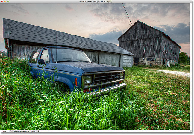
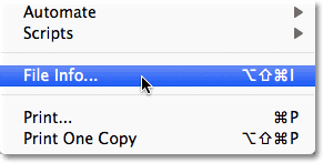
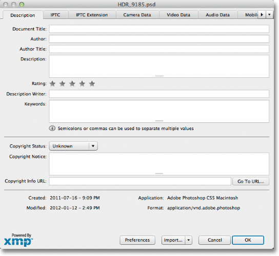
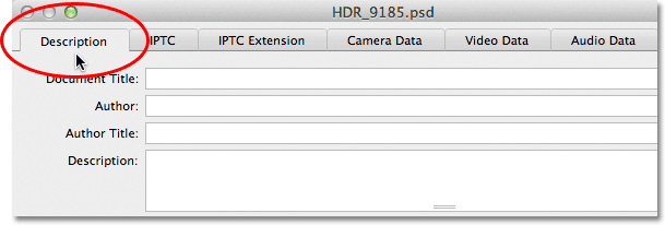
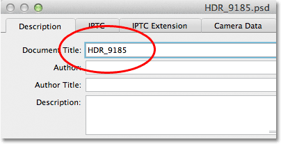
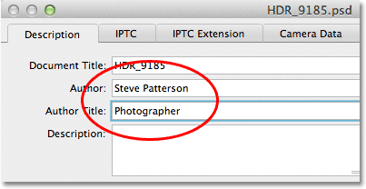
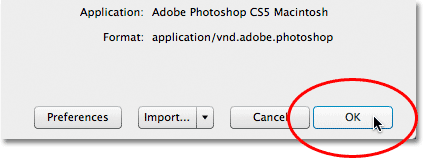
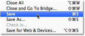
Written by Steve Patterson. There’s no denying that the internet has brought us all closer together, and that it’s made this world of ours a much smaller place. It’s exciting to live in an age where anyone, anywhere, can instantly share their digital photos with family and friends, or if they choose, with millions of complete strangers, simply by emailing their photos or uploading them to personal or social media websites.If you’re a professional photographer, though, who earns a living from your images or uses them to attract new clients, uploading them to the web for all to see isn’t enough. You also need to make sure your contact and copyright information is included with each image so anyone who’s interested can see who owns the photo and how to contact you for more details.Fortunately, as we’ll learn in this tutorial, Photoshop’s File Info command makes it easy to embed this information directly in the image file itself so no matter where its journey through cyberspace may take it, your contact and copyright information will travel right along with it.Download our tutorials as print-ready PDFs! Learning Photoshop has never been easier!Here’s a photo I have open in Photoshop that I’d like to upload to the web:An HDR photo of an old truck in tall grass in front of a weathered barn. Image © 2012 Steve PattersonThe original image.Before I do that, though, I want to add my contact and copyright information to the image. The easiest way to do that is with Photoshop’s File Info command which we can get to by going up to the File menu in the Menu Bar along the top of the screen and choosing File Info:Selecting the File Info command in Photoshop. Image © 2012 Photoshop Essentials.comGo to File > File Info.This opens the File Info dialog box. Details added to an image, like our name and copyright info, are what’s known as metadata, which simply means “additional information” about something. In this case, it’s additional information about our image. There’s lots and lots (and lots!) of metadata than can be included in an image file, which is why, if you look along the top of the dialog box, you’ll see a series of tabs with names like Description, IPTC, Camera Data, and so on. Each tab represents a different category of metadata, and each category has its own panel in the File Info dialog box. You can click on the tabs to switch between the panels (note that I’m using Photoshop CS5 here. If you’re using Photoshop CS3 or earlier, you won’t see the tabs. Instead, the category names will appear in a list down the left side of dialog box):The File Info dialog box in Photoshop. Image © 2012 Photoshop Essentials.comThe File Info dialog box. Each tab along the top represents a different metadata (information) category.For our purposes here, the only metadata category we need to worry about is the very first one, Description. Click on its tab in the top left corner to select it (or click on its name at the top of the list on the left of the dialog box if you’re using Photoshop CS3 or earlier):Clicking on the Description tab in the top left of the File Info dialog box. Image © 2012 Photoshop Essentials.comSelect the Description category.The Description panel contains fields for entering all of our important information, like our name, a description of the image, keywords to help people find the image in a search, copyright details, and so on. The very first field at the top of the list, Document Title, isn’t terribly important but you may want to enter the file name of your image. In my case, the file name is “HDR_9185″ but of course yours will almost certainly be different:Entering the name of the file in the Document Title box. Image © 2012 Photoshop Essentials.comEnter the file name for your image in the Document Title field.Below the Document Title field is the much more important Author field. This is where you enter your name as the author of the image. Below that is the Author Title field. I usually enter “Photographer” if I was the person who actually took the photo, but you can enter a different job title or just leave it blank if you prefer. All you really need here is your name in the Author field:The Author and Author Title fields in the File Info dialog box. Image © 2012 Photoshop Essentials.comEnter your name in the Author field. The Author Title field is optional.Next, enter a description of the image in the Description field. Try to be as detailed as possible since the description can make it easier for people to find your image:The Description field in the File Info dialog box. Image © 2012 Photoshop Essentials.comGive your image a meaningful description.Next, move down to the Keywords field. This one is also very important because giving the image meaningful keywords will make it much easier for people to find it when searching for photos that contain one or more of those subjects. It will also make it much easier for you to find the image yourself in Adobe Bridge. Enter either a semicolon or a comma after each keyword to separate them from each other. A keyword can actually be made up of two or more words (like "weathered barn" or "high dynamic range"):The Keywords field in the File Info dialog box. Image © 2012 Photoshop Essentials.comUse meaningful keywords to describe the contents of your image.Next up is the Copyright Status option. By default, it’s set to Unknown. Click on the word Unknown, or on the small arrow to the right of the word, and choose Copyrighted from the list that appears. Keep in mind that simply claiming that your image is copyrighted isn’t the same as actually applying for a legal copyright, but it’s usually enough to keep most honest people from using the image without your permission:The Copyright Status option in the File Info dialog box. Image © 2012 Photoshop Essentials.comChange the Copyright Status option to Copyrighted.Once you’ve selected Copyrighted, enter your copyright information into the Copyright Notice field. You’ll usually want to include the copyright symbol followed by the year and then your name. To add the copyright symbol, on a PC, press and hold your Alt key and enter 0169 on the numeric keypad of your keyboard. On a Mac, it’s even easier. Just hold down the Option key and press the letter G on your keyboard:The Copyright Notice field in the File Info dialog box. Image © 2012 Photoshop Essentials.comEnter your copyright info into the Copyright Notice field.Last but certainly not least is the Copyright Info URL field. Enter the URL of the website you want people to visit to find out more information about you and your work. Once you’ve entered the URL, it’s a good idea to click on theGo to URL button to the right of the field to make sure you’ve entered the website address correctly:The Copyright Info URL field in the File Info dialog box. Image © 2012 Photoshop Essentials.comEnter the URL of the website people should visit to find out more about you.Once you’ve entered all of your information and have double-checked everything to make sure it’s all correct, click on the OK button in the bottom right corner of the File Info dialog box to close out of it and accept the information:Clicking the OK button to close out of the File Info dialog box. Image © 2012 Photoshop Essentials.comClick OK to accept the information.To permanently embed the new information with the image file, we need to save the image, which we can do by going up to the File menu and choosing Save. Once it’s been saved, you can close out of it. The next time you re-open the image in Photoshop and open the File Info dialog box (File > File Info), you’ll see all of your contact and copyright information displayed in the fields:Choosing the Save command from the File menu in Photoshop. Image © 2012 Photoshop Essentials.comGo to File > Save to permanently attach the information to the image file.And there we have it! That’s how easy it is to add your contact and copyright information to an image using the File Info command in Photoshop!


Panels in Adobe Photoshop


Panels in Adobe Photoshop


As I showed at the beginning of this chapter, keywording images can add value to any catalog. For professional photographers who sell images for a living, good keywording is essential for achieving maximum sales. For amateur photographers who are maintaining an archive of personal photographs, keywording can still add value in terms of making special photographs more easily accessible (see Figure 10.28.). It has taken a while to convince everyone of the importance of keywording, but now that many of us are shooting tens of thousands of photos each year, it is more important than ever now to do what we can to keep our photo catalogs manageable. So how much should you keyword? Professional colleagues of mine, such as Seth Resnick, claim that each image that’s supplied to a picture library should have at least 50 keywords attached if it is to achieve any sales success. Seth generally carries out careful research to look for as many terms and related topics as possible for each of the images he submits. He’ll consider checking for variations in spelling, as well as looking out for hot topic words that might be relevant to something he has just shot. If you are not focused on library sales then this kind of approach may seem like overkill. There is no point in overdoing things and the key is only to spend as much time on the process of keywording as you are likely to benefit from in the future through the time saved when carrying out a file search. Okay, so it’s hard for you to know exactly how much keywording is going to be necessary. I have to confess that I am still kind of catching up with the keywording of some of the older photos in my catalog, but I am at the stage now where every photo has at least one keyword term associated with it.


Figure 10.28. You don’t need to go overboard with your keywording, but adding a few keywords that are relevant can add significant value to each image you annotate. Even if it is just the photos you keep in a personal archive.

TIP

Keywords can be used to describe anything you like. But don’t forget that there are also IPTC fields that can and should be used to enter data such as the location a photo was shot in. While keywords provide a single place for entering informational data, the fields in the IPTC data section are regarded as the formally correct place for entering such data. If you sell photos for a living it makes sense to follow industry conventions and make sure you fill out these sections rather than rely solely on keywording to do this.

You can add keyword metadata via the Import Photos dialog as you import your images (Figure 10.29) or you can add or edit the keywords later via the Keywording panel. Figure 10.30 shows how I have sorted some of the keywords in my Keyword List panel into a hierarchy of keyword categories (also referred to as a controlled vocabulary). In the Places keyword category there is a keyword subcategory called Europe and within that Norway, and within that Bygdøy peninsula. So the full keyword path here is: Bygdøy peninsula > Norway > Europe > Places. Note how you enter keyword metadata in this order placing the child keyword before the parent. This photo also contains the keyword Seascapes, which is a child of the parent keyword Nature subjects and the full keyword path here is: Seascapes > Nature subjects. You will find that it pays to establish a proper keyword hierarchy that suits the content of your library and give some careful thought as to how you wish to structure a controlled vocabulary.


Figure 10.29. You can add keywords at the time of import. In this example, I entered the relevant keywords into the Keywords field so that these would be applied to all the photos as they were imported. Lightroom offers to auto-complete a keyword if it recognizes that the word you are typing might belong to the keyword list.


Figure 10.30. Alternatively, you can go directly to the Keywording panel and type in the keyword or keywords you wish to assign to a selected photo (in the box where it says “Click here to add keywords”). In this example I typed in “Bygdøy peninsula > Norway > Europe > Places” to add the keyword “Bygdøy peninsula” with the desired hierarchy.

Three ways to add new keywords

As I just mentioned, you can add keywords as you import images into the catalog (Figure 10.29) or add and edit keywords via the Keywording panel (Figure 10.30). You can also add keywords to the Keyword List panel in anticipation of the keywords that will be needed (Figure 10.31). Once such a controlled vocabulary has been set up you can select an image you want to update, choose a keyword from the Keyword List panel, and click in the box to the left (Figure 10.34). This adds the chosen keyword to the selected photo. Whichever method you use, once a keyword has been added, it will from then on always appear listed in the Keyword List panel. But once the keywords are there, you can always rearrange them into a suitable hierarchy. After a keyword has been created, Lightroom can then auto-complete keywords for you as you start typing in the first few letters for a new keyword entry. Apart from making it quicker to enter new data, this helps you avoid duplicating keyword entries through careless spelling or typos. Lightroom also auto-assigns the correct hierarchy. For example, the next time I might choose to add the keyword seascapes, the seascapes keyword will be automatically applied to the image using the keyword path seascapes > Nature subjects (Figure 10.32). I’ll be coming back to this point later, but basically when you enter a keyword, Lightroom is able to auto-complete the keyword and at the same time knows to assign the correct keyword hierarchy. The only problem that arises is where a single keyword can have more than one context and therefore appears listed in more than one hierarchy.


Figure 10.31. You can also add keywords in advance. In this example, I right-clicked on the Norway keyword and chose Create Keyword Tag inside “Norway.” This opened the Create Keyword Tag dialog. I then added “Bygdøy peninsula” as a child of Norway.


Figure 10.32. In this example, the Bygdøy peninsula keyword is a subset of Places > Europe > Norway and the Seascapes keyword is a subset of Nature Subjects.


Figure 10.33. Here you can see the Edit Keyword Tag dialog for the keyword “car.” Under the Keyword Tag Options, all the boxes are checked, allowing keywords to be included on export, for all the containing keywords (such as “land transportation,” which is part of the keyword tag hierarchy), and to include the synonyms entered here when exporting.


Figure 10.34. When you roll the mouse over a keyword in the Keyword List panel, a check box appears to the left of the keyword. If you click in this box, you can add a tick mark, which means the keyword is added to the currently selected image or images. If you click the arrow to the right of the keyword count number, Lightroom filters the catalog to show all photos that share the same keyword.

Keeping metadata private

There is some metadata that you might wish to keep private and it is possible when creating new keyword tags or editing existing keywords to hide “sensitive” keyword content, such as personal attributes that you would not want others to see. For example, one might find it useful to use a keyword term such as: heavily manipulated > Private metadata. You could use this to annotate photos that had a lot of work done to them in Photoshop. It might not matter all that much for all your clients to see such a keyword tag, but some might prefer that this didn’t show up. This is just a tag that is useful for me and not relevant to include on export (because I may sometimes need to filter out image examples that have had a lot of work done to them in Photoshop). Figure 10.35 shows an example of an image of a holiday property, where one might want to keep the location metadata hidden. For example, if you were in the business of supplying location services to clients it wouldn’t really be in your best interests to reveal the exact location details within the metadata. This would apply to keeping any GPS data hidden as well, but that can now be addressed separately within the Export dialog (see page 414).


Figure 10.35. Here is an example an image where, in some instances, you might like to keep the location metadata private.

Synonyms: The hidden keywords

Within keywords it is possible to include synonyms (see Figure 10.33). Synonyms are keywords, too; they’re basically alternative terms that can be used in place of the main keyword, which may or may not overlap with other keyword terms. The key difference between synonyms and keywords is that synonyms, although they are searchable the same way as keywords, actually remain hidden from view in the Keywording List panel. This may seem odd, but there is a good reason for this as I’ll explain in the following paragraph. Basically, keeping synonyms hidden can help keep the Keyword list less cluttered.

In the Figure 10.33 example the keyword car uses the following hierarchy: car > automobile > land transportation > TRANSPORTATION. Using the keyword settings shown here, when any file using this keyword is exported the full keyword hierarchy would be included. However, there are other search terms that people might want to use when searching for cars, such as: auto, motor, or vehicle. Ultimately, any image tagged using the single keyword car, would be discoverable using any of the following search terms: car, automobile, land transportation, transportation, auto, motor, or vehicle. The benefit of using synonyms is that they allow you to include more potential keyword search terms within a single keyword in the keyword list, but without cluttering up the entire list with lots of different keywords that are essentially variations of a single keyword term. When creating keywords for locations, if it is important that other people find your photos there are good reasons to consider including foreign language versions of a name in order to reach a maximum audience. For example, English-speakers might say “Venice,” whereas the Italians will (correctly) say “Venezia.” When I was photographing in Scotland recently a lot of the places I photographed had both English and Gaelic names. Therefore, the Gaelic versions might be suitable for including as synonyms.

new photoshop free download


new photoshop free download
Adobe Photoshop products, free downloads | Photoshop.com


Adobe Updates Creative Cloud with New Photoshop Features, Team Version, Digital Publishing Tools
Tuesday December 11, 2012 6:22 am PST by Eric Slivka
Following up on its announcement regarding Retina display support for Photoshop CS6 and Illustrator CS6, Adobe today announced additional major upgrades to its Creative Cloud subscription service. The upgrades, which are currently exclusive to Creative Cloud subscribers, are headlined by a number of upgrades to Adobe's flagship Photoshop application.
- Immediate support for HiDPI (Retina) displays for Apple MacBook Pro. This feature was also made available to perpetual license customers as a free update.
- Smart Object support for Blur Gallery and Liquify.
- The ability to quickly export CSS code for text and objects, and import color swatches to easily design incredible websites.
- New workflow timesavers including Crop tool refinements.
- 3D enhancements including improved live (OpenGL) previews of shadow effects and additional control over illumination using 32-bit color picker to create glow effects.
- Conditional Actions that automatically select the appropriate Action based on user-defined rules, giving users enhanced image processing speed.
Creative Cloud has also been enhanced with a new version designed to support teams of users, updates to the Adobe Muse web design tools, a new Creative Cloud Connection desktop syncing app, and new training tools.


Finally, Adobe is promoting a demo of its Digital Publishing Suite, Single Edition at its Create Now event today. The software helps designers create digital publications for the iPad using many of the same tools used by major publishers to bring their content to the App Store.

Adobe's Create Now event begins at 10:00 AM Pacific / 1:00 PM Eastern and will be streamed live on the Creative Cloud Facebook page.

cloud text effect psd-Cloudify Text EffectBy Diego Sanchez in Photoshop,Tutorial


Cloudify Text EffectBy Diego Sanchez in Photoshop,Tutorial 

Note: In order to make this action work in any language, we need to take some steps using the menus (instead of shortcuts) so we can fully control the names of every single layer we make. We will also create a PSD template to start with, in order to work more comfortably.
1) Let´s start with the template. Go to File > New and set the name of the new document as “Template”, the width to 600 and height to 450 and click OK. Please note that you can set any width and height you wish, but I will be working in a 600 x 450 pixels canvas for you to have a better view on the tutorial screenshots.
2) Press “D” to reset the swatches. Go to Layer > New Fill Layer > Gradient. Set the name to “Background Sky” and click OK.
3) In the new window, click over the gradient and select the first gradient. We do this on order to set both colors to 100% opacity.
4) Double click over the small black square, and in the new window set the color to #adbcd6. Click OK. Now, double click over the small white square, and in the new window set the color to # 4a6cba. Click OK. Click OK once again. In the last window, set the Style to Linear, the Angle to 90º, the Scale to 100% and be sure to have Align with Layer checked. Click OK.
5) Now, you should have a document like this.
6) Before proceeding with the action, we need to provide a text layer for the user to start with; so hit the “T” on your keyboard to select the Text Tool. Set the typeface to Sansumi-UltraLight, the size to 300pt, the Anti-aliasing method to Sharp, the text alignment to Center and the color to white (#ffffff). Click over the canvas and type “Y”.
Note: to change the text color, simply click over the color rectangle and select the desired color in the new window. Click OK.
Next, click over the layer name in the layers panel and set the name to “TEXT”.
Go to File > Save and save it to your desired location.
7) Now that we have our base file ready, it is time to make the assets we need to make the action. These assets are the brushes. Hit the “B” on your keyboard in order to select the brush tool, and now open the brush window: Go to Window > Brush and click over the New Brush icon.
8) Set the name to “300” and be sure to have the”Capture Brush Size in Preset” checked. Click OK.
9) Under Brush Tip Shape, apply the following values:
10) Under Shape Dynamics, apply the following values:
11) Under Texture, apply the following values:
If you do not have the “clouds” texture loaded, click over the texture thumbnail, and in the new textures window, click on the arrow next to the thumbnails. From the dropdown list, select “Texture Fill” and click OK. Now that you have the textures loaded, select “clouds”.
12) Under Transfer, apply the following values:
13) Finally, be sure to have checked Airbrush and Smoothing.
14) Now that we have made or brush, we must save this values to a Tool´s Preset file (TPL). To do so, and with our brush tool and settings still selected, click over the brush icon in the tools palette. From the dropdown thumbnails list click over the “New” icon. Set the name to “300” and be sure to uncheck the “Include Color” option. Click OK.
Now, our brush is available in our Tools Preset Panel.
15) With the base file ready and our assets created, it is time to make the action. First, close all the opening documents and open “Template.psd” (the file we´ve just created). In the Layers panel, click over an empty space in order to have no layers selected.
16) If you do not have the Actions Panel visible, go to Window > Actions. Click on the Create New Set icon and set the name to Cloudify. Click OK.
As you can see, now we have our Cloudify Action Set created, but we still need to create the action file, so let´s do that.
17) In the Actions Panel, click over the the Create New Action Icon, and set the name to 300. Click Record. From now on, every single step we make will be recorded into the action, so be sure to follow the instructions exactly as shown.
18) Press “D” on your keyboard to reset the color swatches and click over the TEXT layer in the Layers Panel. Notice how these two steps are being recorded in the Actions Panel.
19) Go to Layer > Type > Create Work Path.
20) Go to Layer > New > Layer and set the name to “1”. Click OK.
21) Press “B” on your keyboard to select the brush tool. Click over the brush icon in the tool´s palette and from the dropdown menu select the brush we have made “300”.
22) Press “X” on your keyboard to switch Foreground and Background colors (this will make White our Foreground Color).
23) Press “P” on your keyboard to select the Pen Tool and right click (Control+click on Mac) over the canvas. From the dropdown menu select Stroke Path. Be sure to have Brush as the selected Tool and uncheck “Simulate Pressure”. Click OK.
24) Go to Layer > New > Layer and set the name to “2”. Click OK.
25) Press “X” on your keyboard to switch Foreground and Background colors (this will set Black as Foreground Color).
26) Press “P” on your keyboard to select the Pen Tool and right click (Control+click on Mac) over the canvas. From the dropdown menu select Stroke Path. Be sure to have Brush as the selected Tool and uncheck “Simulate Pressure”. Click OK.
27) We will repeat the last 3 steps one more time to give our clouds more realism. Go to Layer > New > Layer and set the name to “3”. Click OK.
28) Press “X” on your keyboard to switch Foreground and Background colors (this will set White as our Foreground Color).
29) Press “P” on your keyboard to select the Pen Tool and right click (Control+click on Mac) over the canvas. From the dropdown menu select Stroke Path. Be sure to have Brush as the selected Tool and uncheck “Simulate Pressure”. Click OK.
30) Now that the main steps are made, it´s time for some adjustments. First, hide the layer “TEXT” by clicking over the eye´s icon in the layers panel.
31) Select the layer “2” and bring down the opacity to 25%.
32) Finally, click the STOP icon in the actions panel to finish recording the action.
33) Now that we have our assets and action created, let´s see a practical example on how to use it. First, close all the opening documents and open “Template.psd”. Go to Image > Canvas size and set a Width of 1500px and click OK. As you will notice, the background sky is filled thanks to our “Background Sky” layer made with Gradient Fill.
34) Press “T” on your keyboard to select the text tool, and type “LAYERS” in the TEXT layer.
35) Now, go to your Actions Panel, select the action named “300” inside the Cloudify group and press PLAY.
36) And that´s the end of the Cloudify tutorial.